


HARTA
Visual Identity
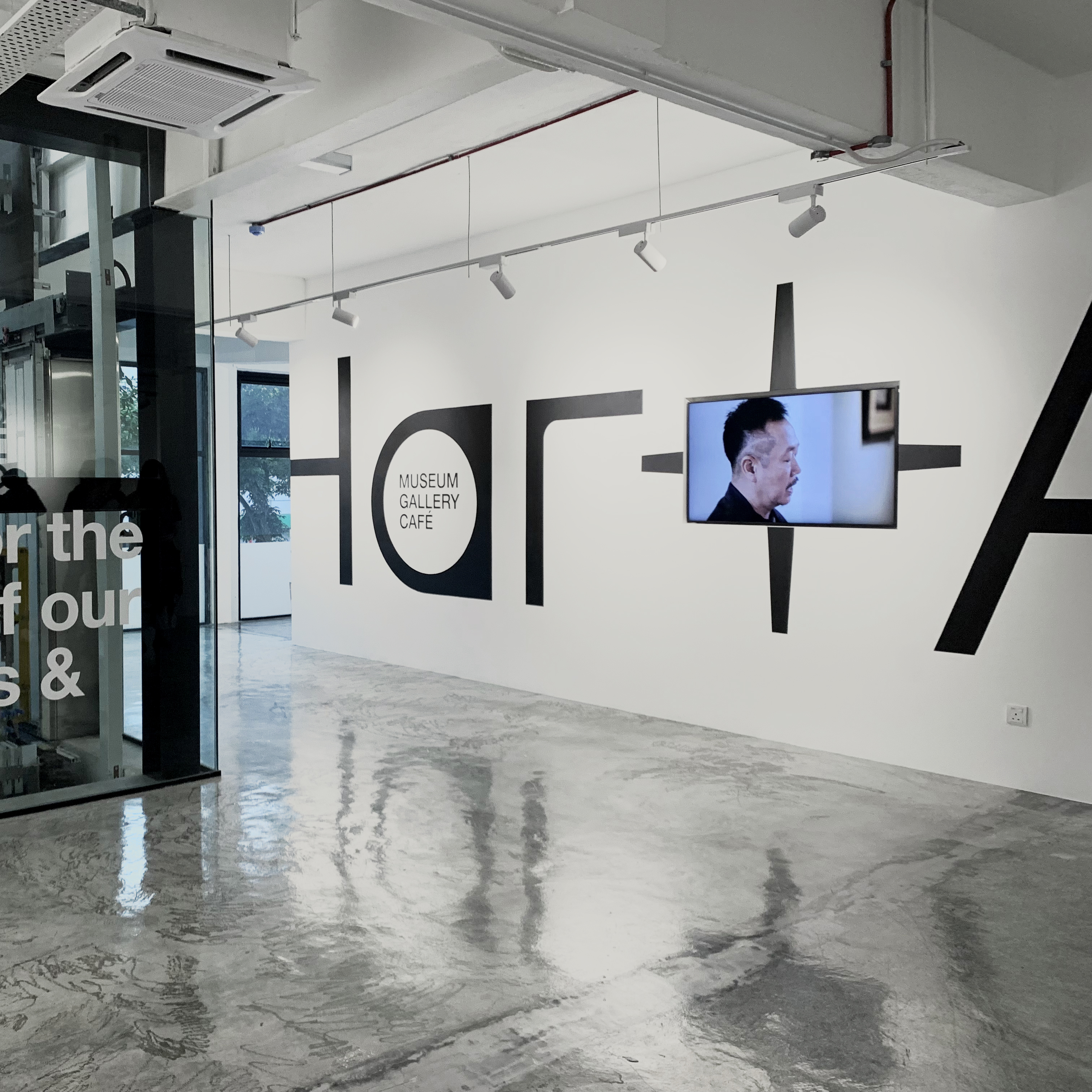
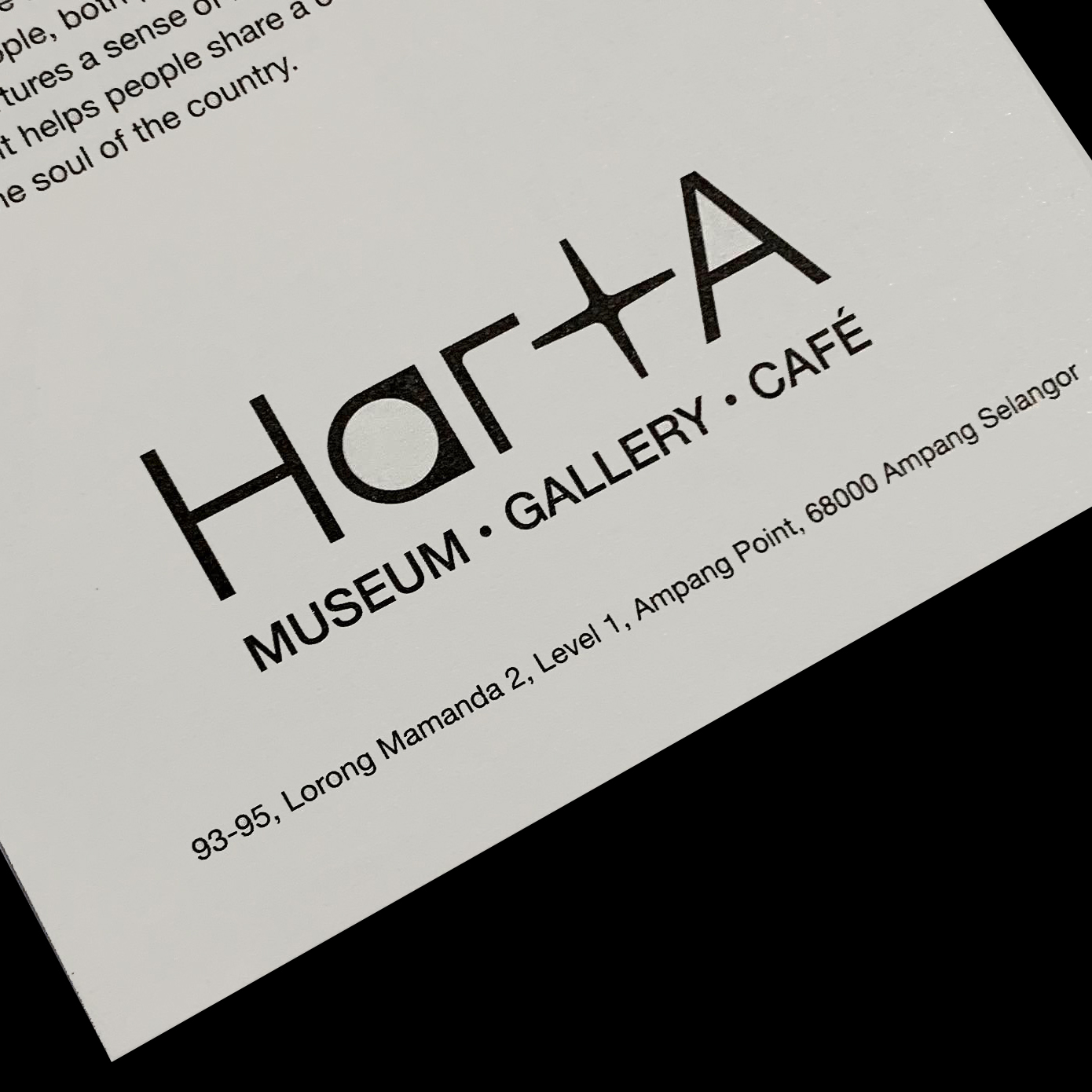
HARTA is a new jewellery history museum, art gallery and cafe at Ampang, founded by Habib. Harta means treasure in the Malay language. Taking this as a starting point, we develope a visual language that could reflect the client’s decades of leading experience in jewellery and craft, while still rooted in simplicity. The logotype ‘a’ looks like a ring turned 90 degrees, while ‘t’ is derived from the client’s motherbrand logo. The visual identity is designed to be both contemporary and rooted in traditions, conveying the core values of Harta.
2023
Are You Living or Leaving?
Visual Artwork
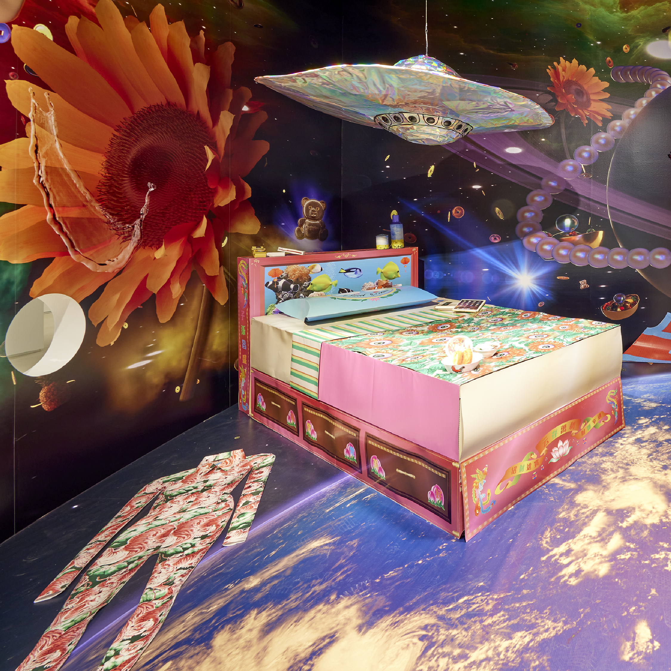
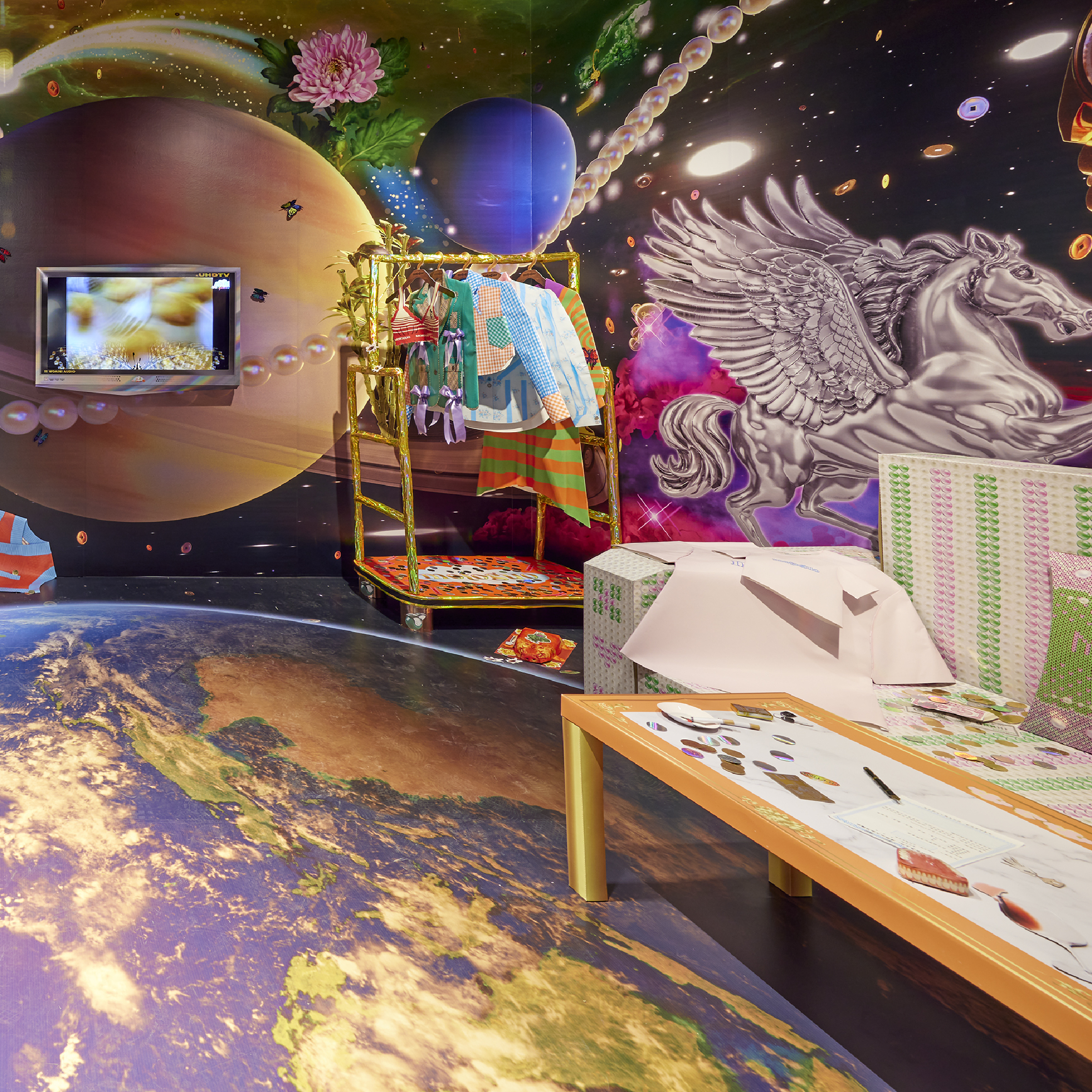
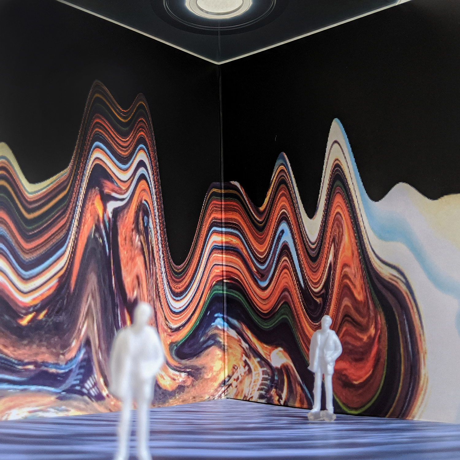
Created in collaboration with Motoguo for the exhibition Cloud Walkers at Leeum Museum of Art, Seoul. Are you Living or Leaving? is an imaginative depiction of a living space in the afterlife—a playful speculation about altenative possibilities in the clouds. By interpreting the act of burning Zhizha (paper effigies) as a mode of non-material transmission, the artwork draws a connection to the mode of communication that take place in the meta-world of expensive NFT luxury goods and “netherworld vaccines”, giving shape to a surreal space where real and virtual, “living” and “leaving” are together.
Supported by Leeum Museum
Photography by Sangtae Kim
2023

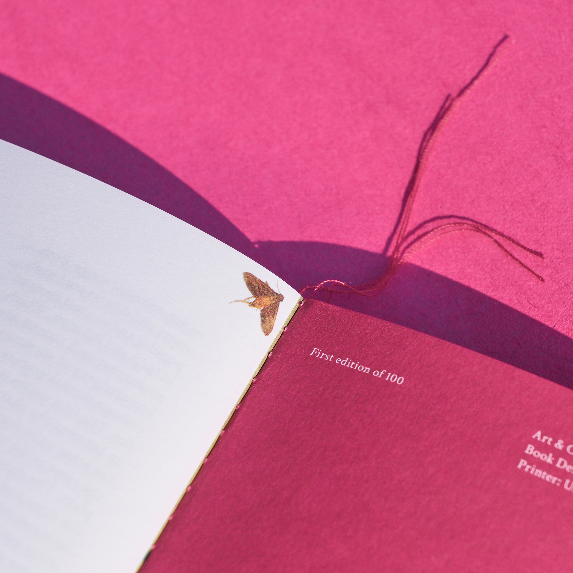

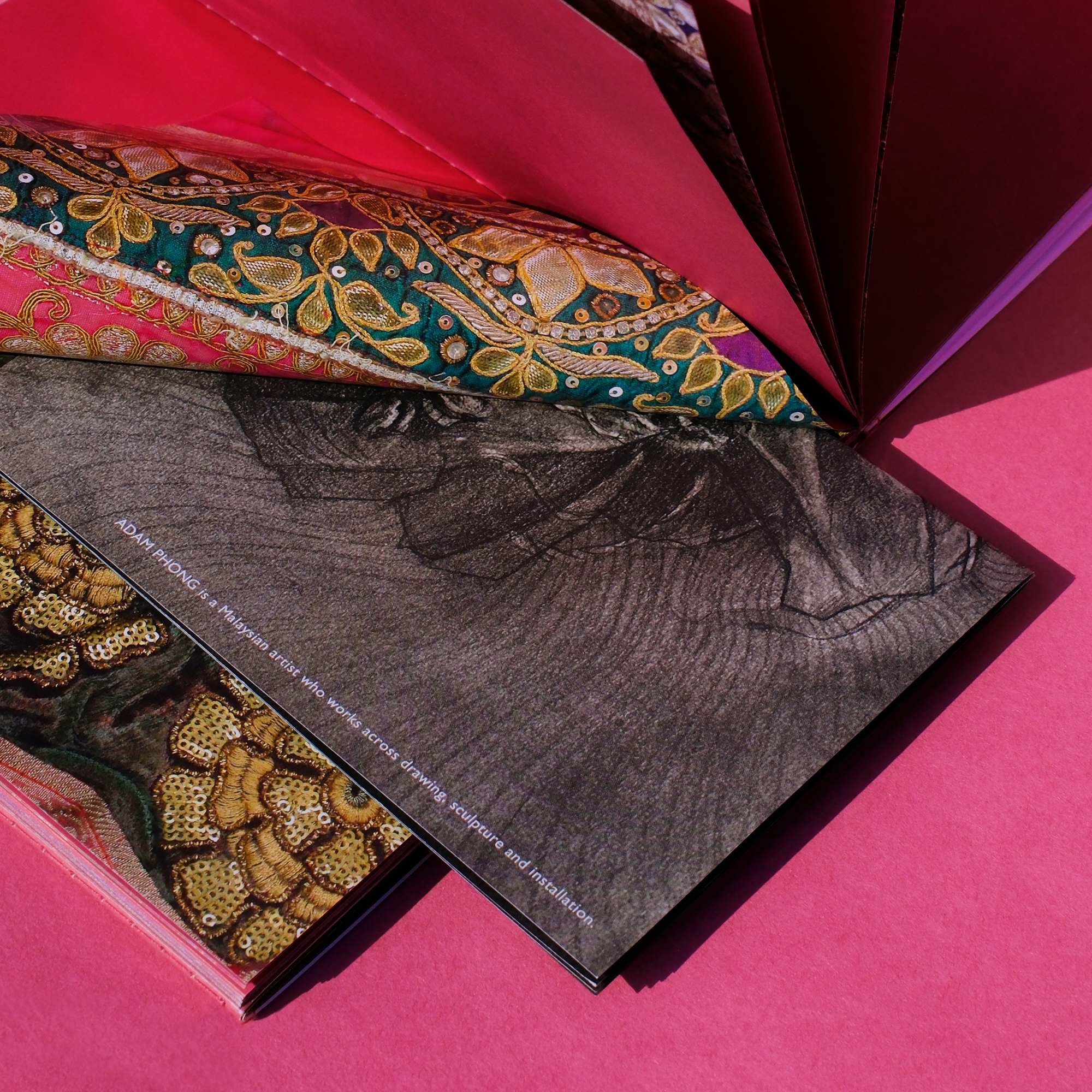

333 Step
Book Design
333 Steps is a book designed for Qasim Riza Shaheen, featuring the artist’s past works and an extension of Qasim’s most recent works - The Beetroot Robe. The book is the artist’s mythical journey through colours and characters, searching for the perfect shade of pink. The book is divided into 3 sections, sewn binded with pink thread. The middle section is made up of butterfly folds/pockets, with Qasim’s textle works printed on the insides—where the artist inserted notes of memories from his journey.
128 pages, 150x80mm
Published by HOME Publications
Photography by A Warm Window
2022


Penrose
Visual Identity
Penrose is a cocktail bar at Chinatown, Kuala Lumpur. Named after Roger Penrose. the menu design follows the 5-fold geometric form of a Pnerose. Featuing a range of cocktails which are based on 5 compound structures of alochol, taste, body, dilution, and flavour. A set of flavour symbols are also designed, as seen on the rim of the coin.
2022

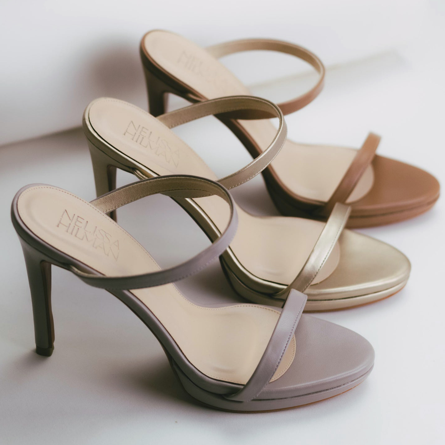
Nelissa Hilma
Brand Identity
Brand Refresh for Nelissa Hilman - a Malaysian women's footwear brand, established in Kuala Lumpur in 2012. Nelissa Hilman designs shoes that celebrate women, and is built around its community, creativity and collaborations. The ‘S’ ligature in the logotype represents sustainability and support, the sole and soul of the brand.
Photo courtesy of Nelissa Hilman
2022
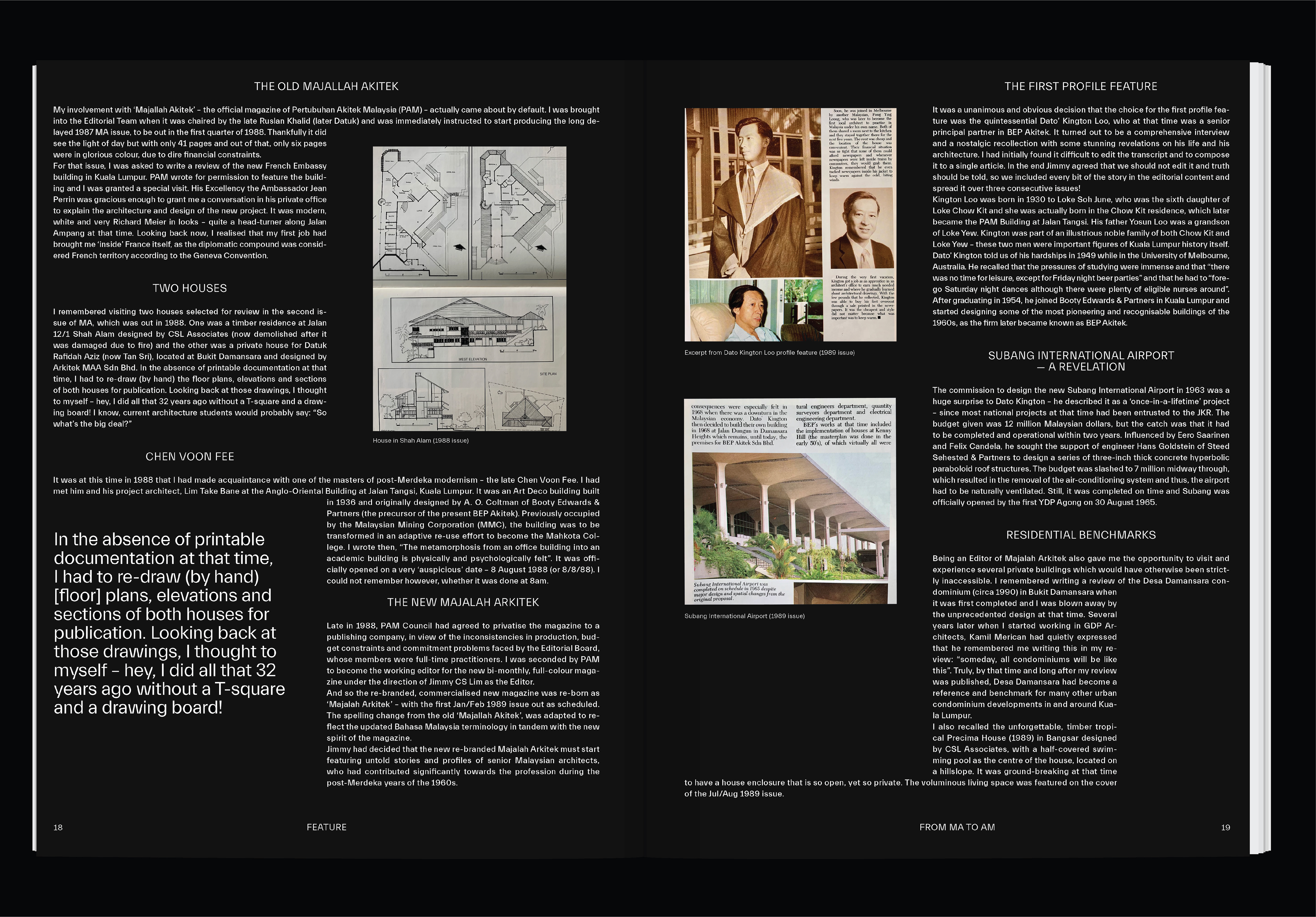
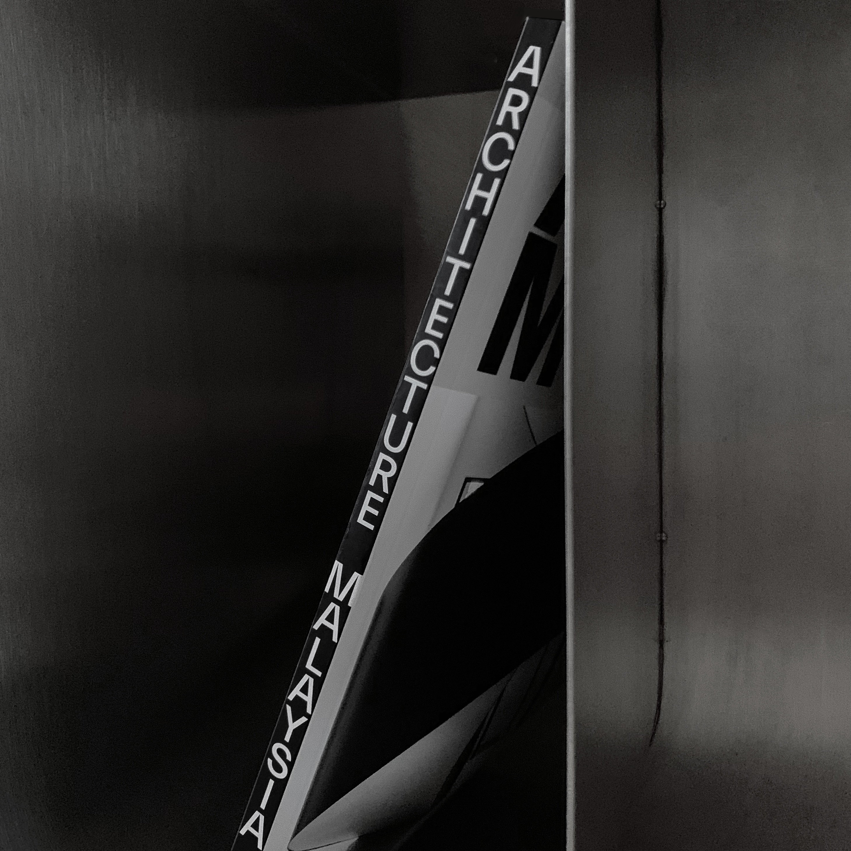
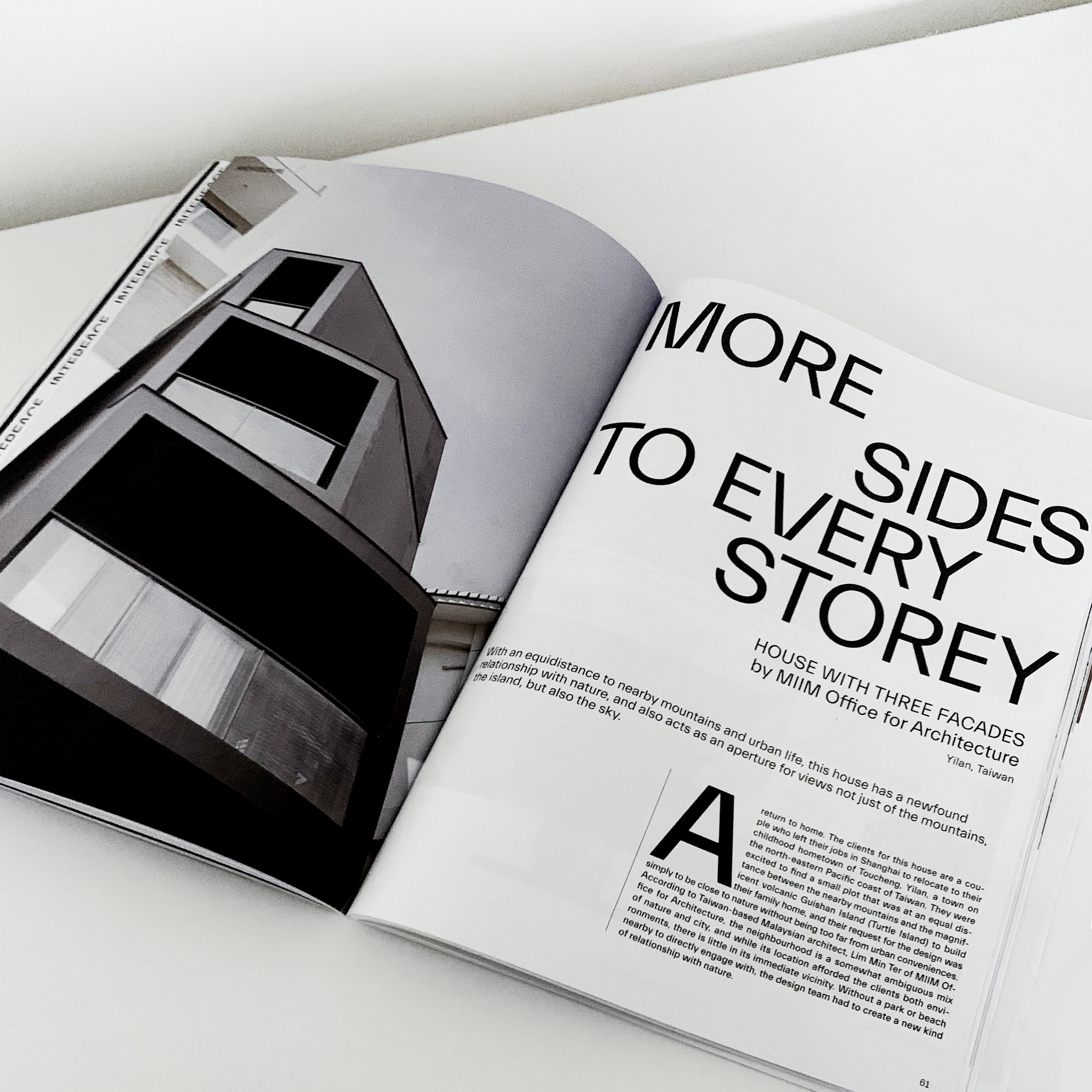
Architecture Malaysia
Magazine Design
Magazine design for Architecture Malaysia, featuring the works and projects of Malaysian architects. In these redesigned issues in 2021, AM seeks to go beyond its boundaries, and include conversations with designers, art specialists, historians, and many more. The grid of the magazine takes on a similar approach, shifting within the compositions of the paragraphs and overlapping columns.
2021

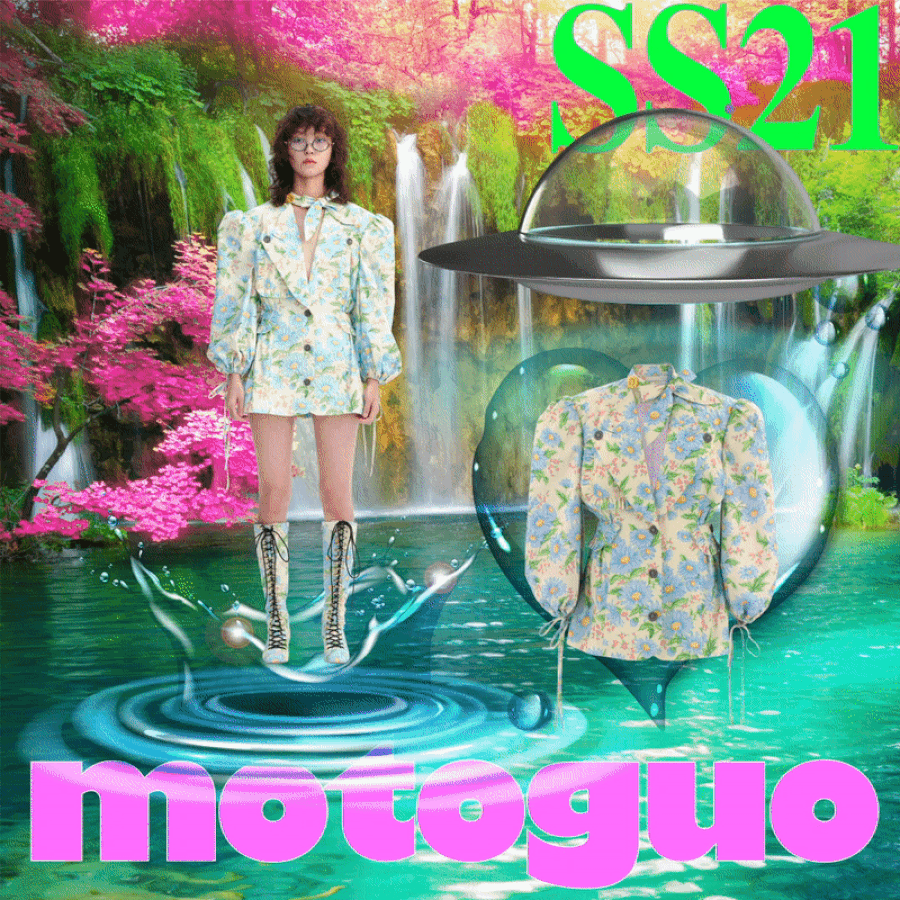
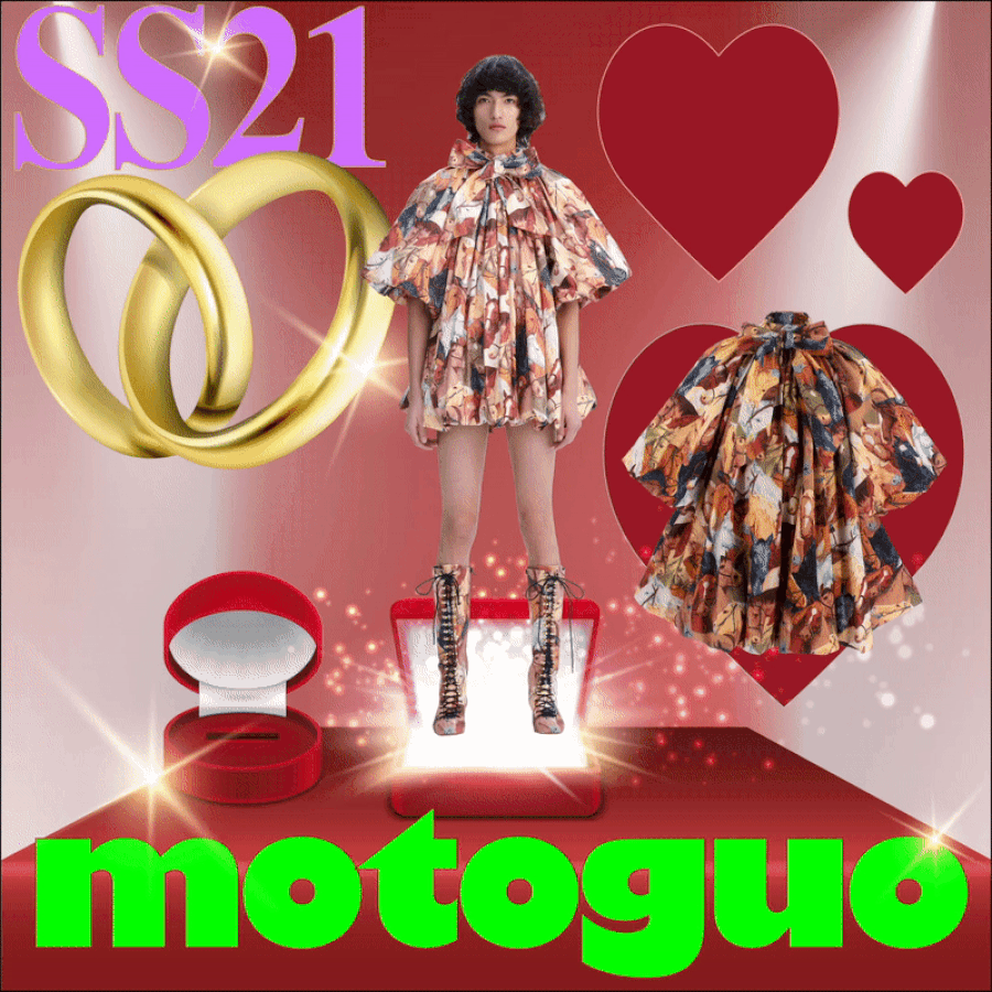
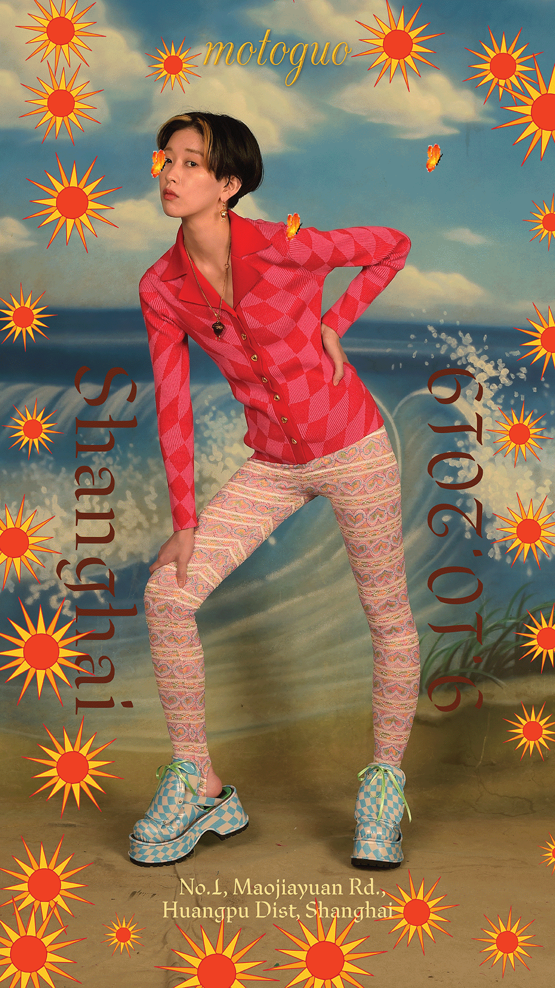
Motoguo
Digital Posters
A series of animated posters showcasing motoguo’s spring/summer 2021 look book. “Come to us, we celebrate you”. The collection being about love and gratitude, celebrates mini milestones and being at ease with the ups and downs in life.
2021
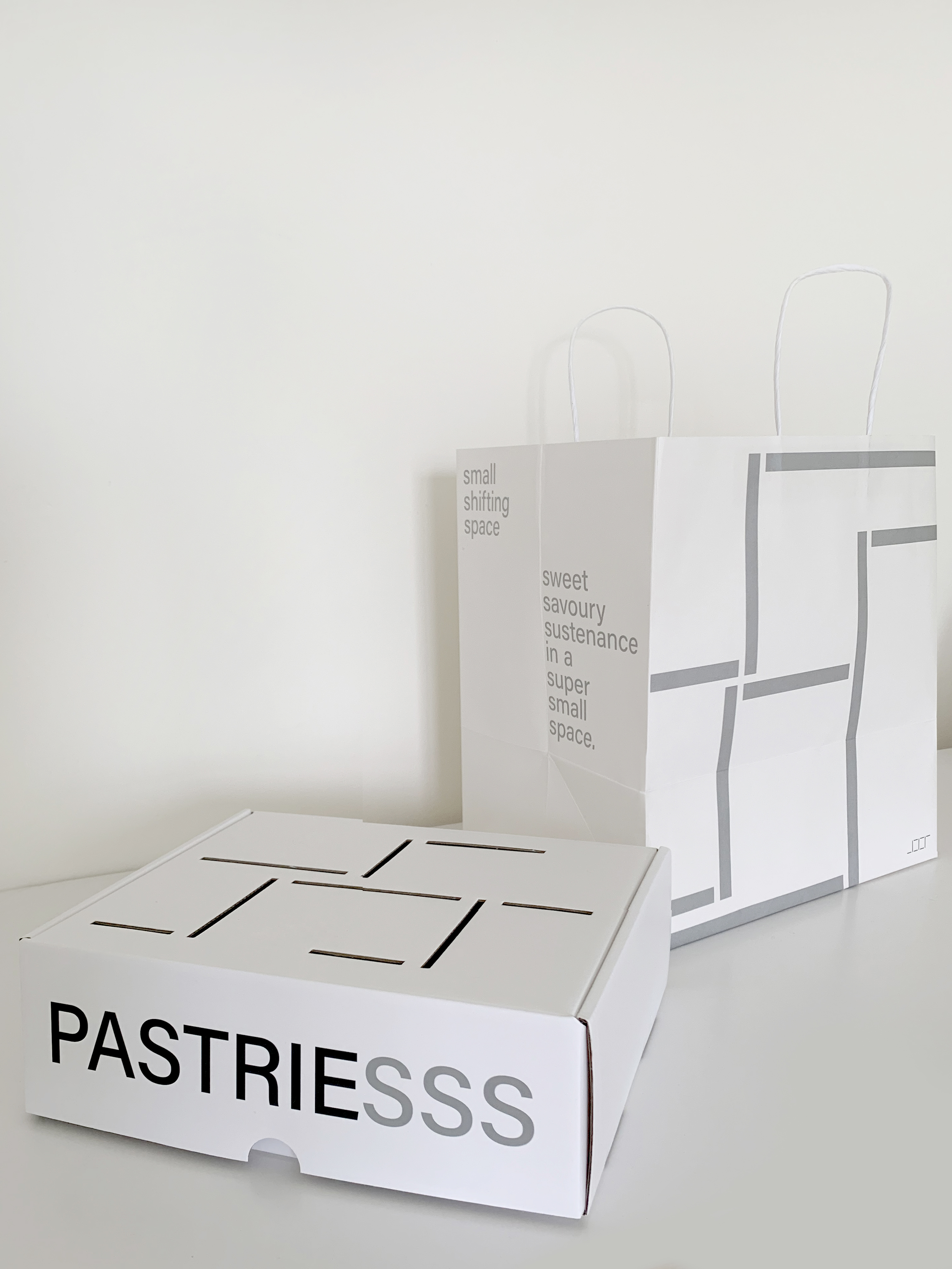
Small Shifting Space
Visual Identity
Small Shifting Space is a comforting nook by day; a snazzy wine bar by night. Serving sweet and savoury food. SSS’s visual identity stands for sleek simplicity with style.
2020
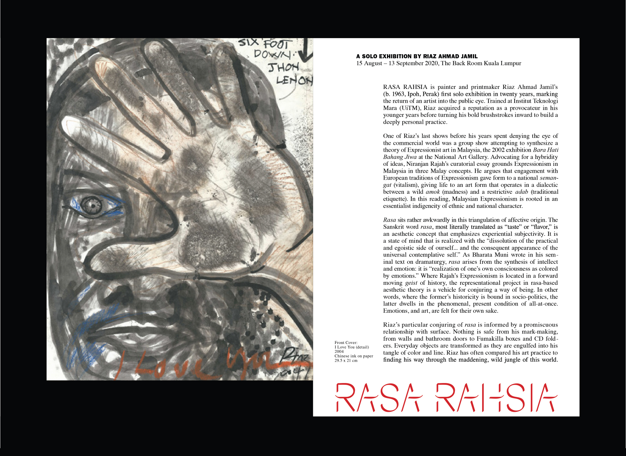
Rasa Rahsia
Exhibition Design
Rasa Rahsia - A solo exhibition by Riaz Ahmad Jamil at The Back Room, Kuala Lumpur. As the Artist paints with tools and brushes that he makes on his own, the exhibition title takes on a similar tone.
2020
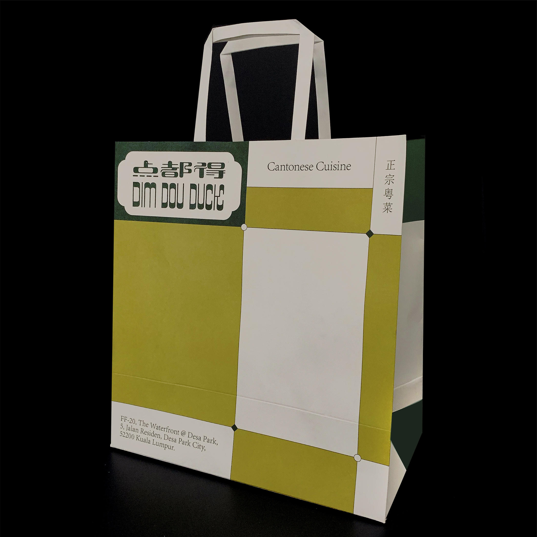
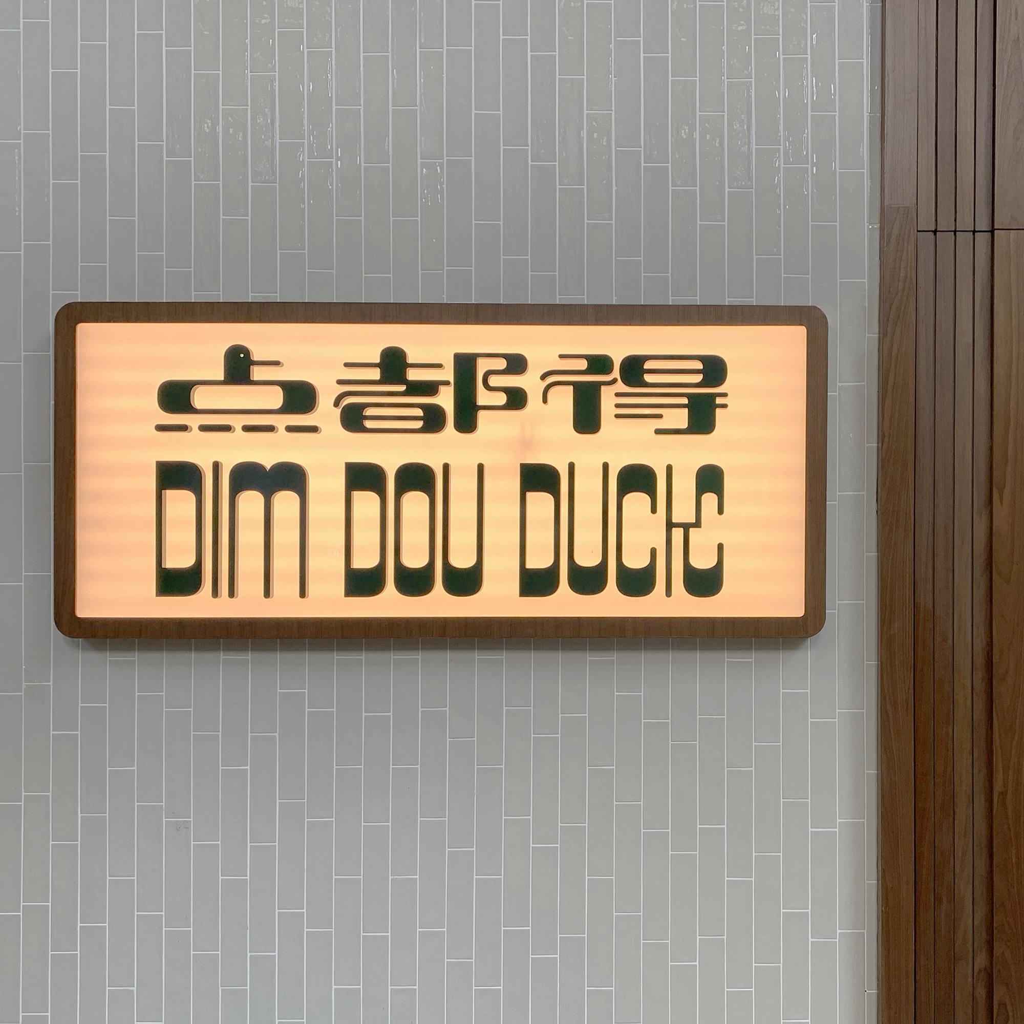
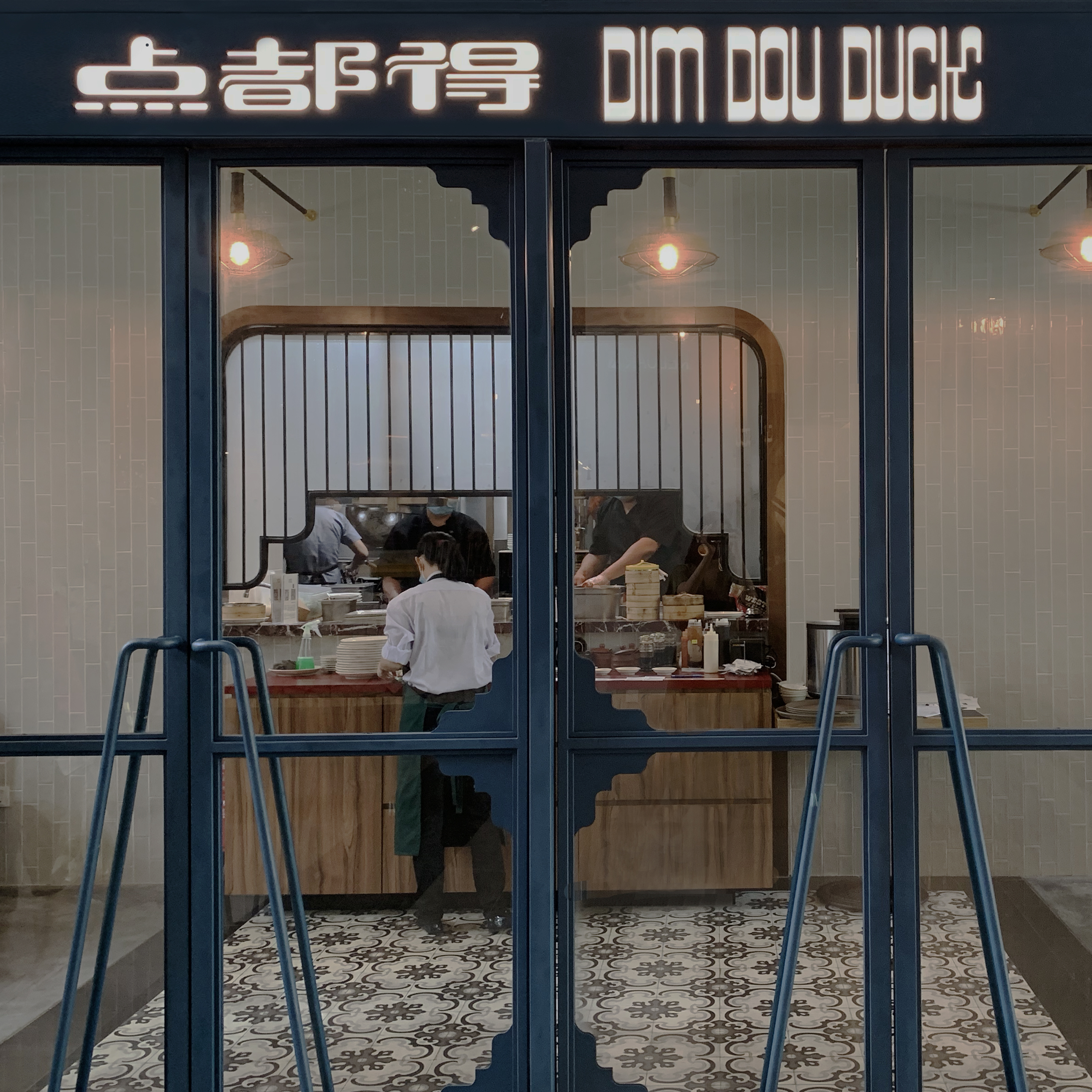
Dim Dou Duck
Visual Identity
Dim Dou Duck is a restaurant at Desapark Waterfront which specialises in charcoal roasted meats and delicious cantonese classics.
2020
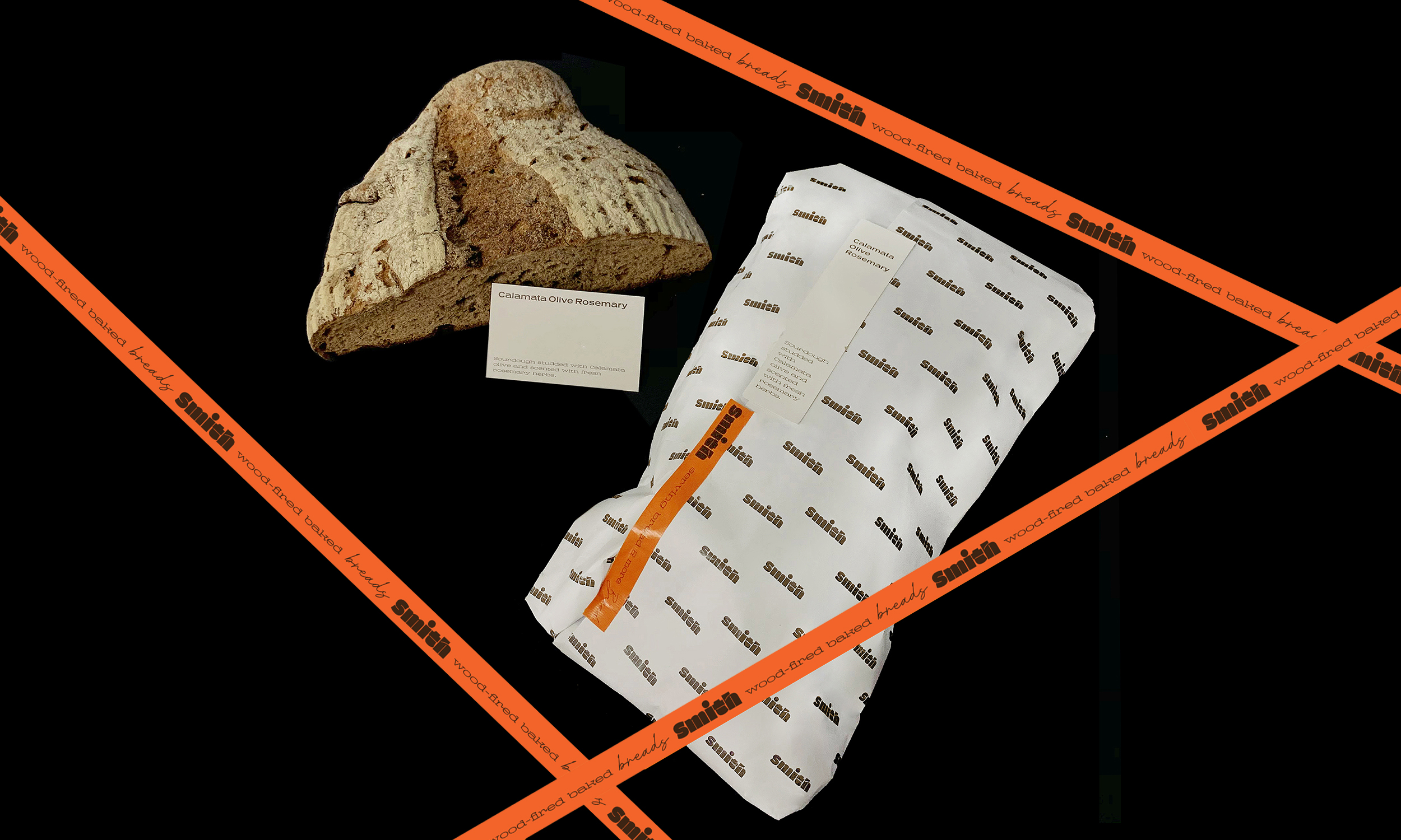
Smith
Visual Identity
Smith is a neighbourhood breadsmith and cafe at Damansara Heights, serving wood-fired oven sourdough breads, cakes, coffee and kombucha on tap.
2020
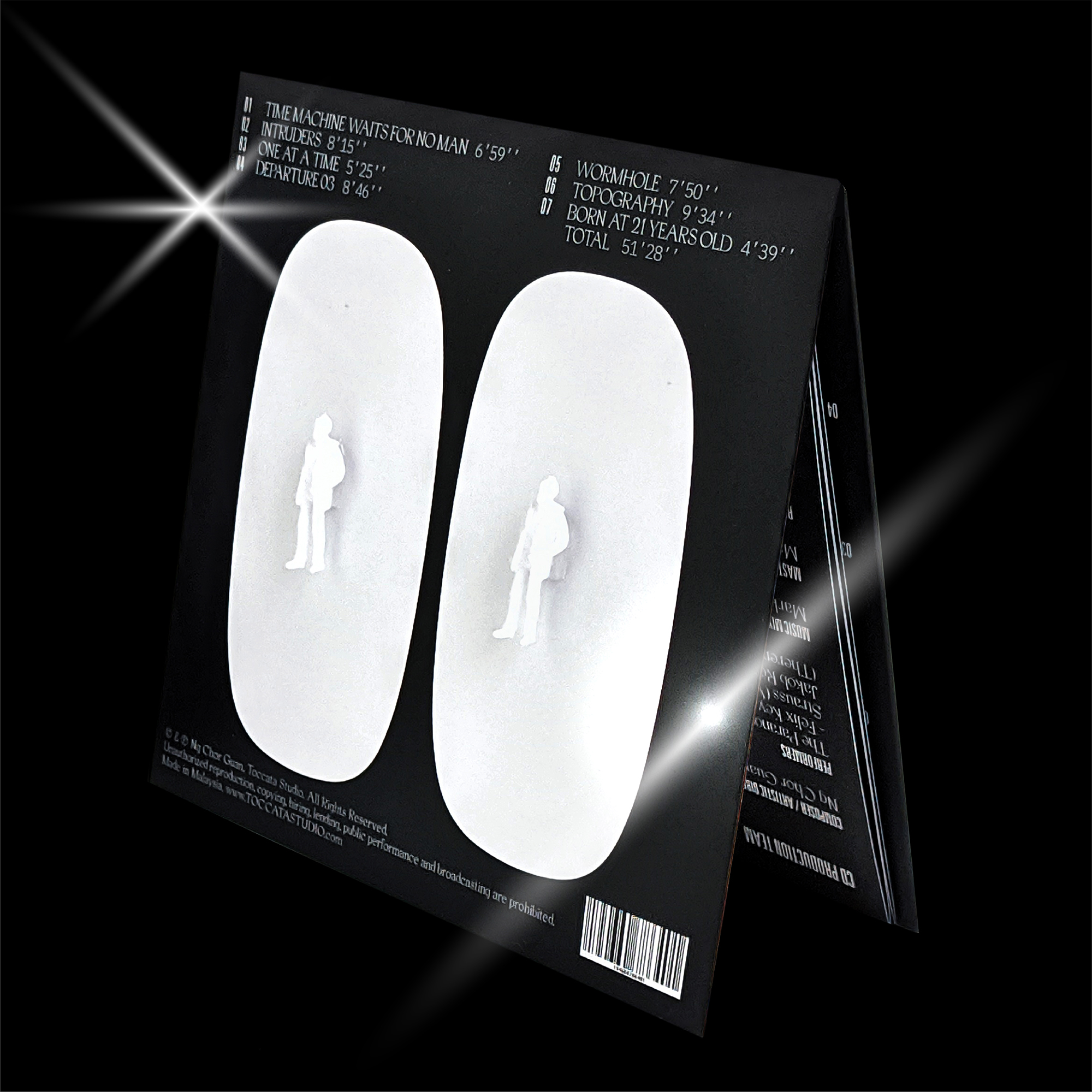
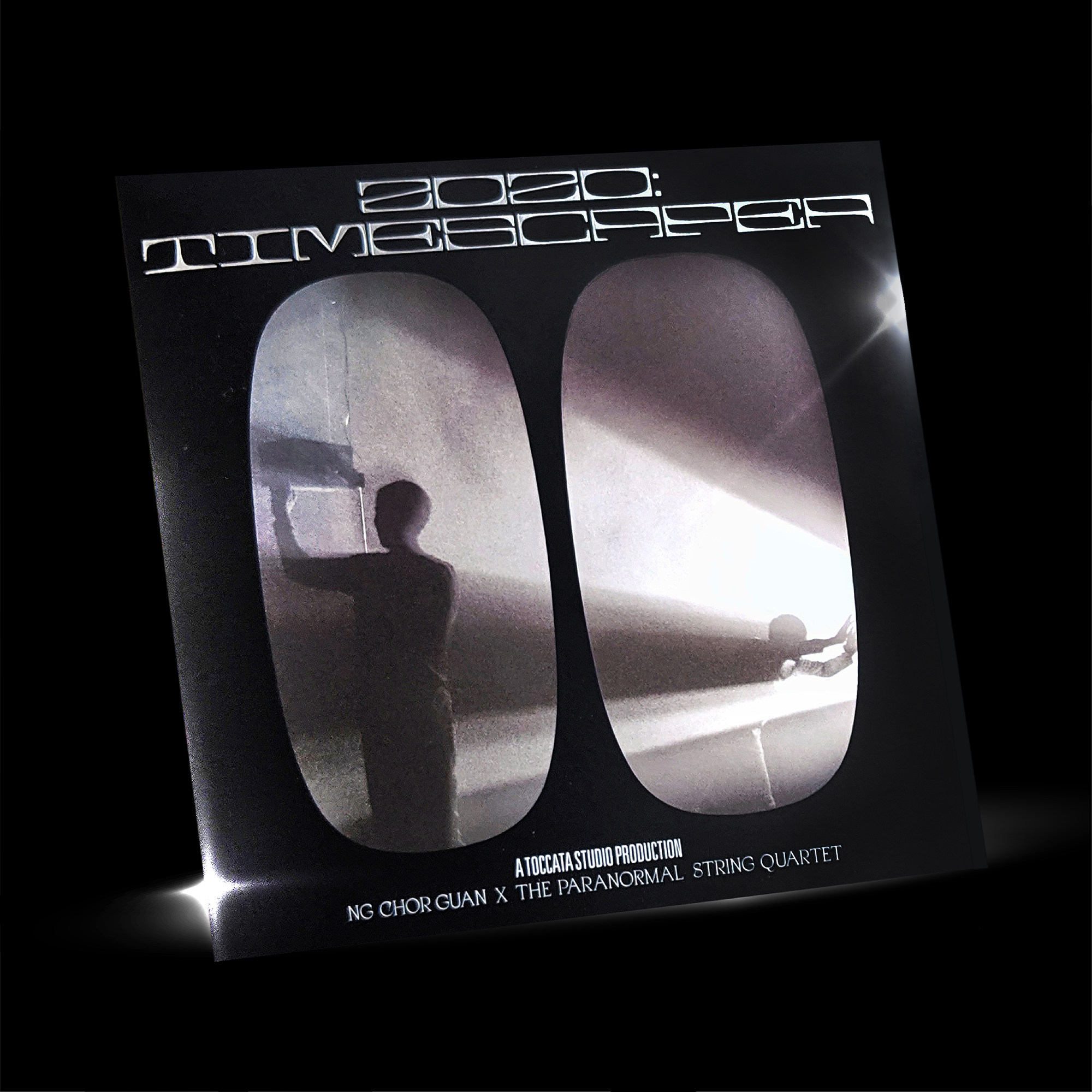
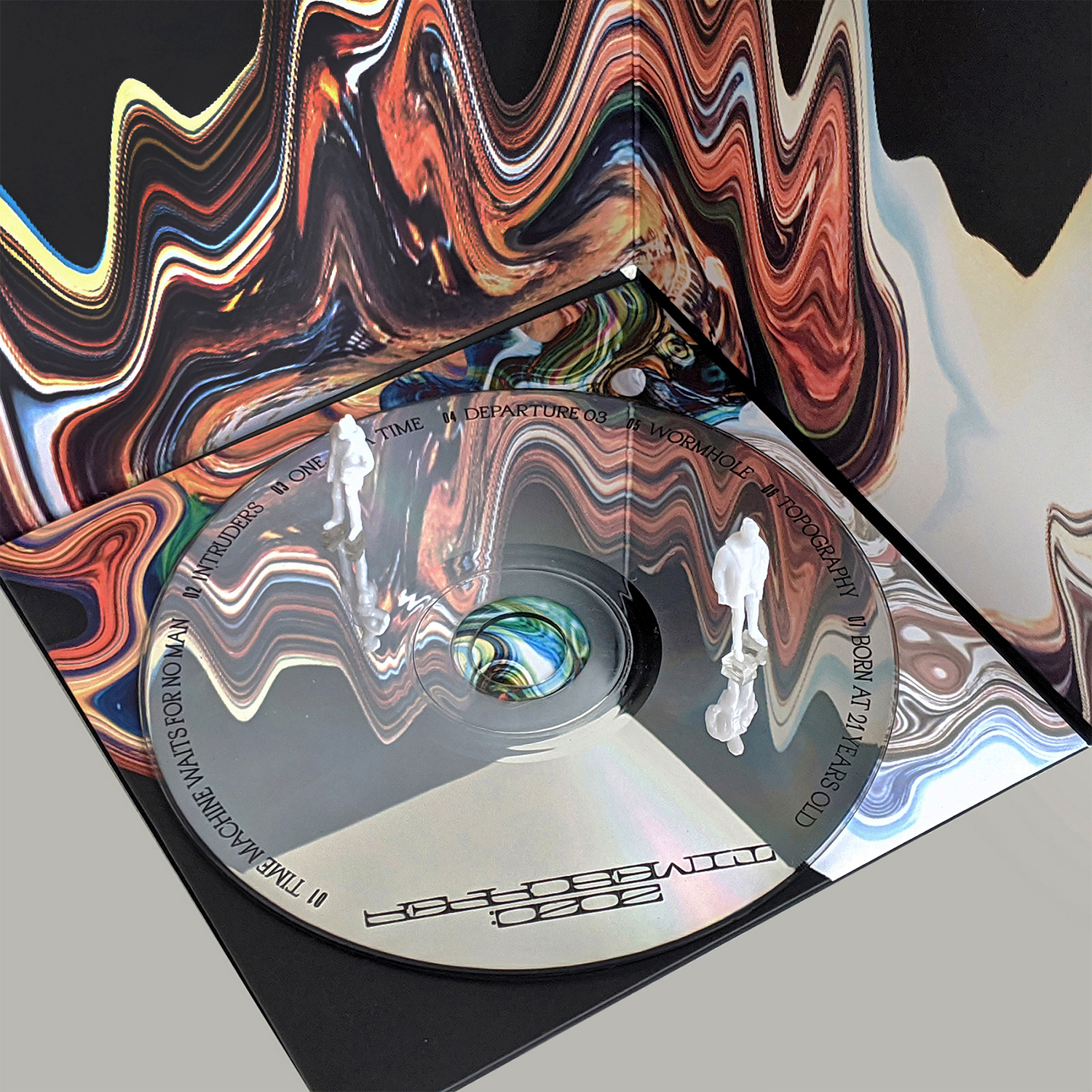
2020:Timescaper
Album Cover
2020:Timescaper interrogrates the idea of time and space, pushing the boundaries of the perfect vision and creation of futures. The album comes with two miniature figures representing the human clones, while the cover can be folded into a 3D representation of outer space.
2020
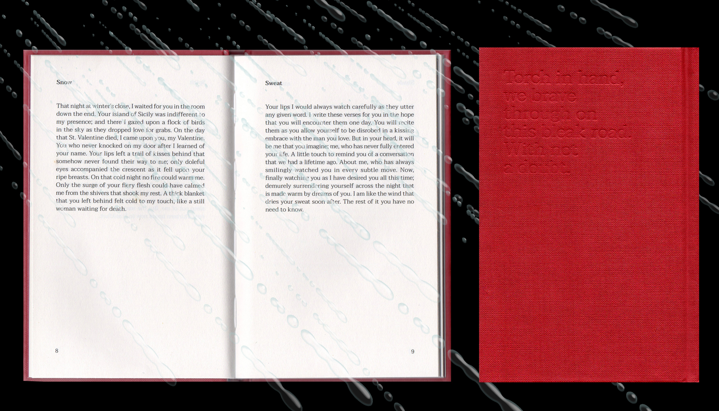
Blooms of Ire
Book Design
Blooms of Ire by Hafiz Hamzah, translated from the original Malay poetry collection titled Gertak Sanggul. Blooms of Ire is an examination of passion as the blood of life — the underlying current behind a heated glance, a passive gesture, a memory from a time long ago.
2020

Pow Down 2020
Visual Identity
POW DOWN 2020 is a design forum by POW ideas. In the theme of ‘CLARITY’, the forum examines the speakers’ journey in striving for clearness in their body of works, how they desire to be seen and heard and why obscurity can blur boundaries in their creative process.
2020

Motoguo SS20
Key Visuals
Even Odder marks the 5th year of the duo's fashion label. For their spring summer collection, Motoguo celebrates their journey on their garments with cream cakes, bubbles, flowers and of course their usual dose of honesty, sarcasm and peculiarity.
2019
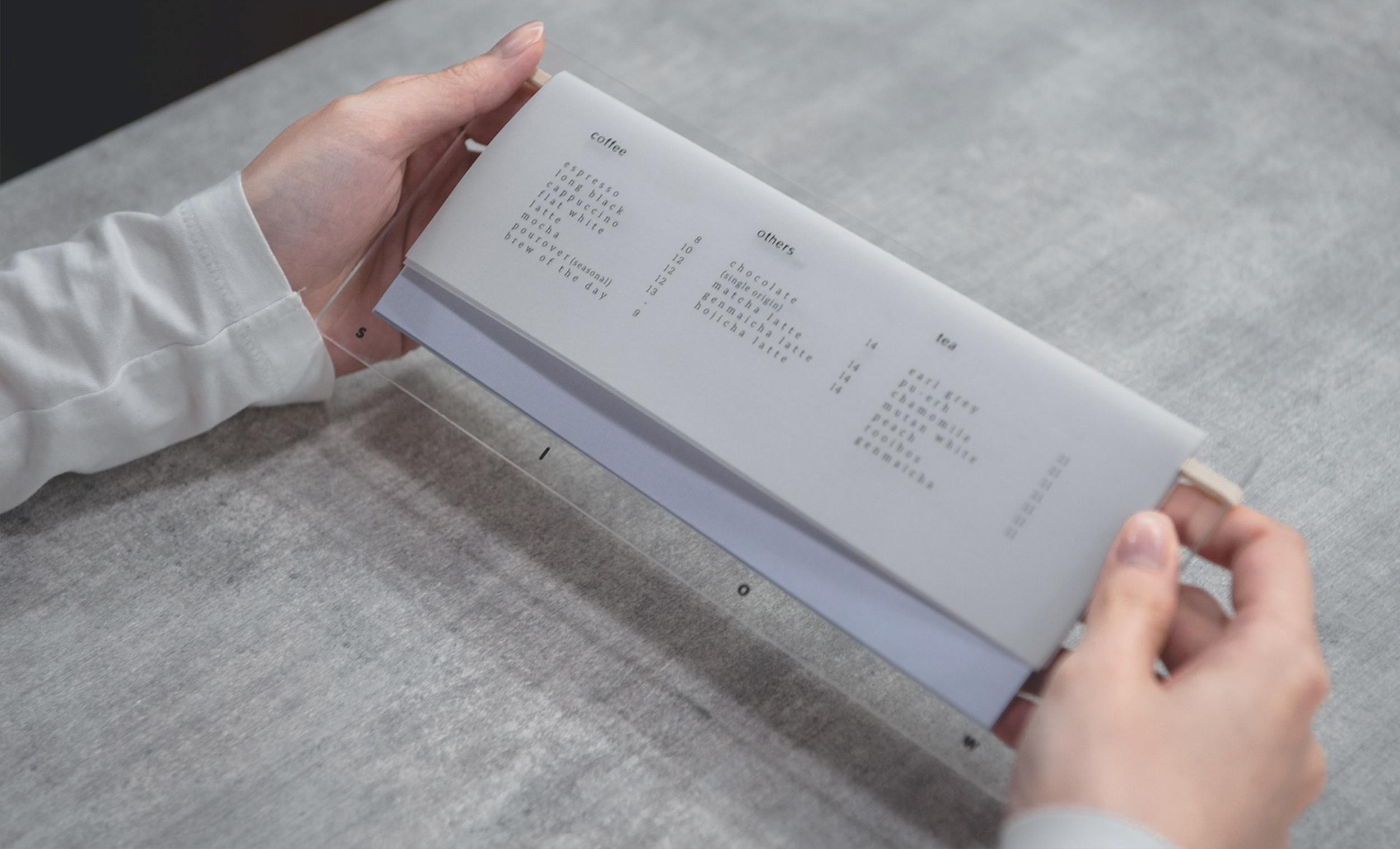

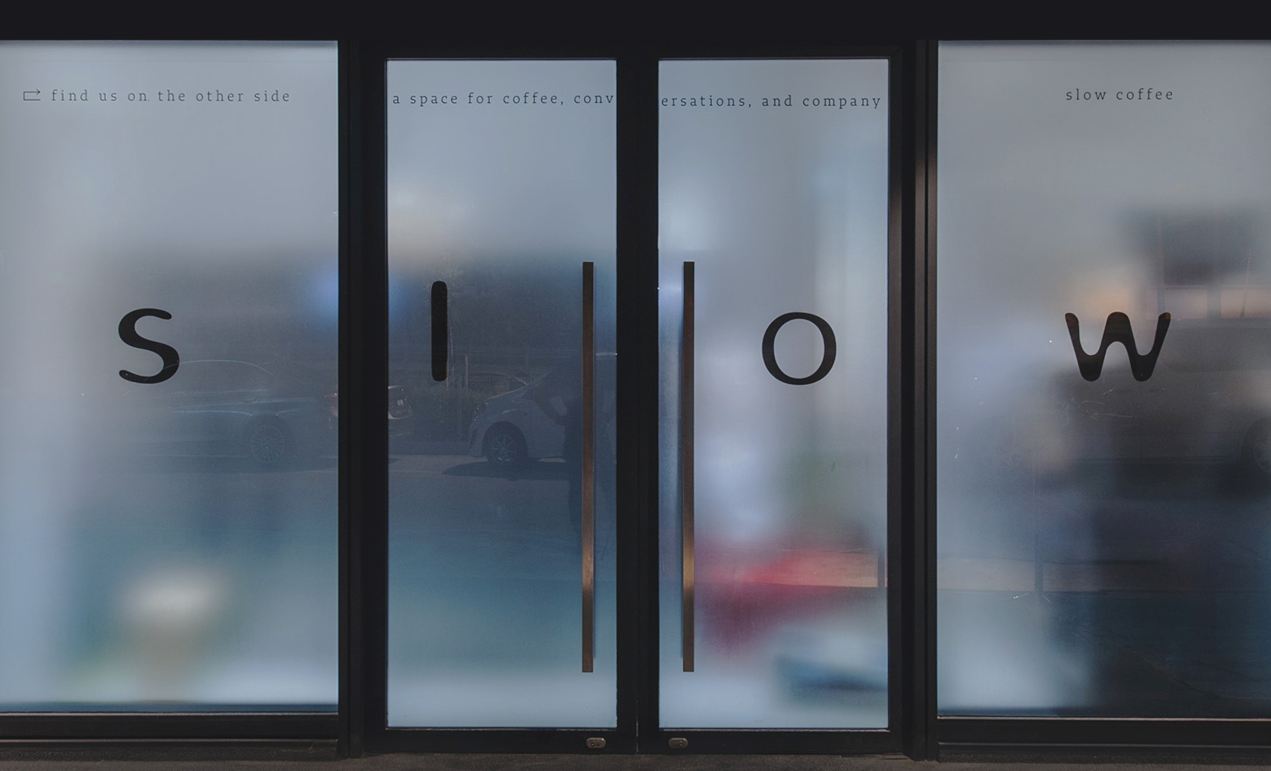
Slow Coffee Bar
Visual Identity
To reflect the brand's value in slow living and its zen-inspired interior, the visual identity takes on a similar direction — playing with the language of slowness with motion blurriness. Interior design by Whitespade, photography by ELMT Studio.
2019
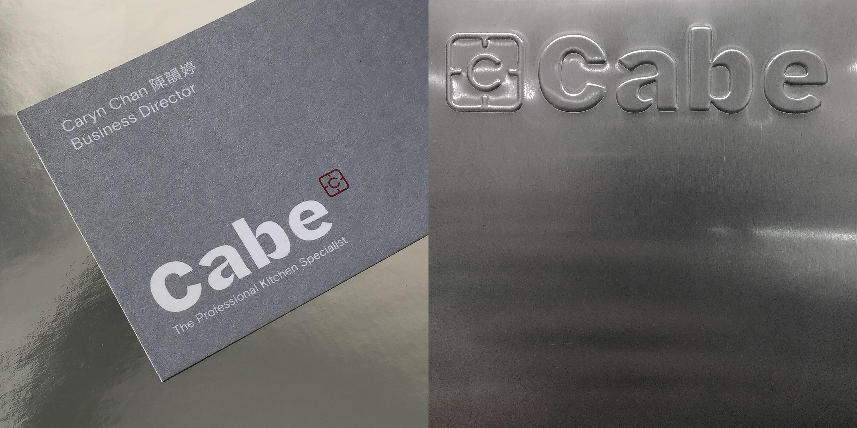
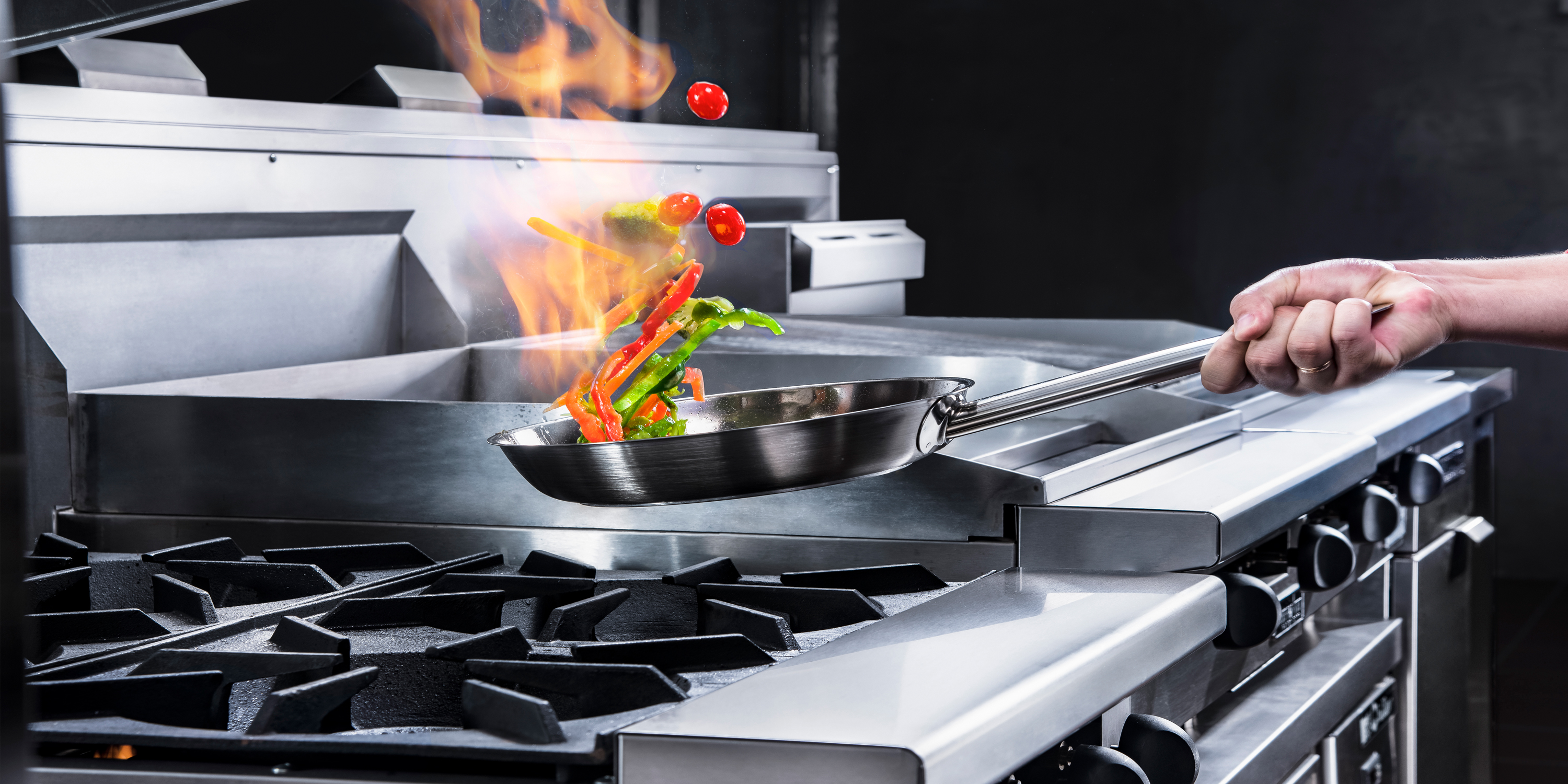
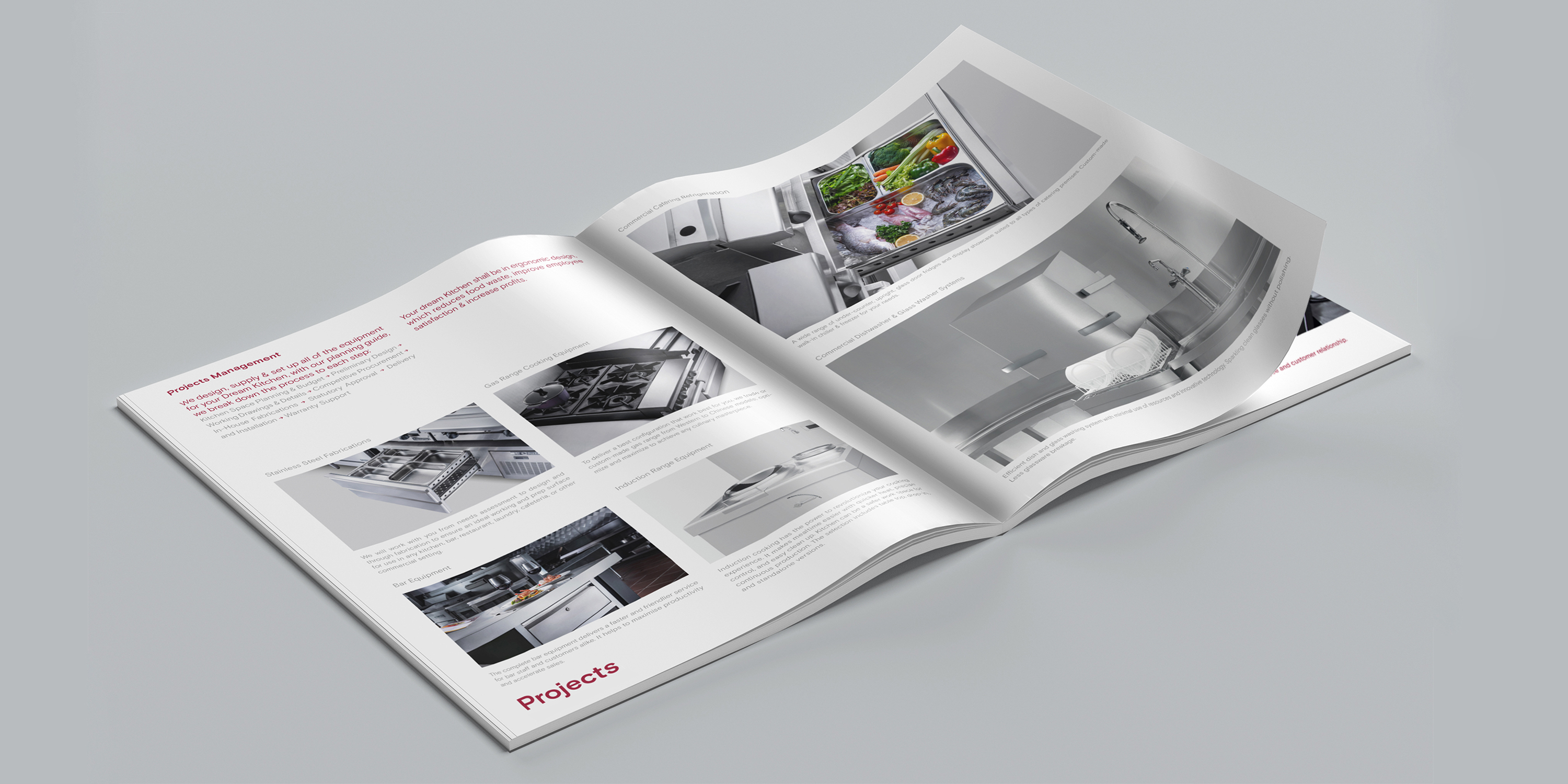
Cabe
Visual Identity
Cabe is a professional kitchen specialist that provides kitchen designs and equipment solutions. Cabe’s symbol illustrates a stove and its logotype with letterforms that reflect the characteristics of fire, with an attention to detail.
2019
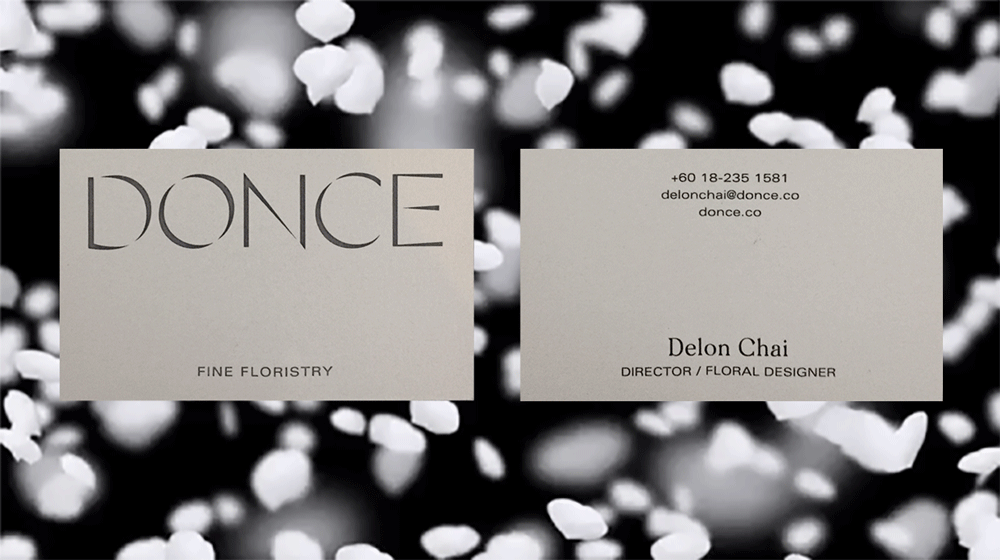

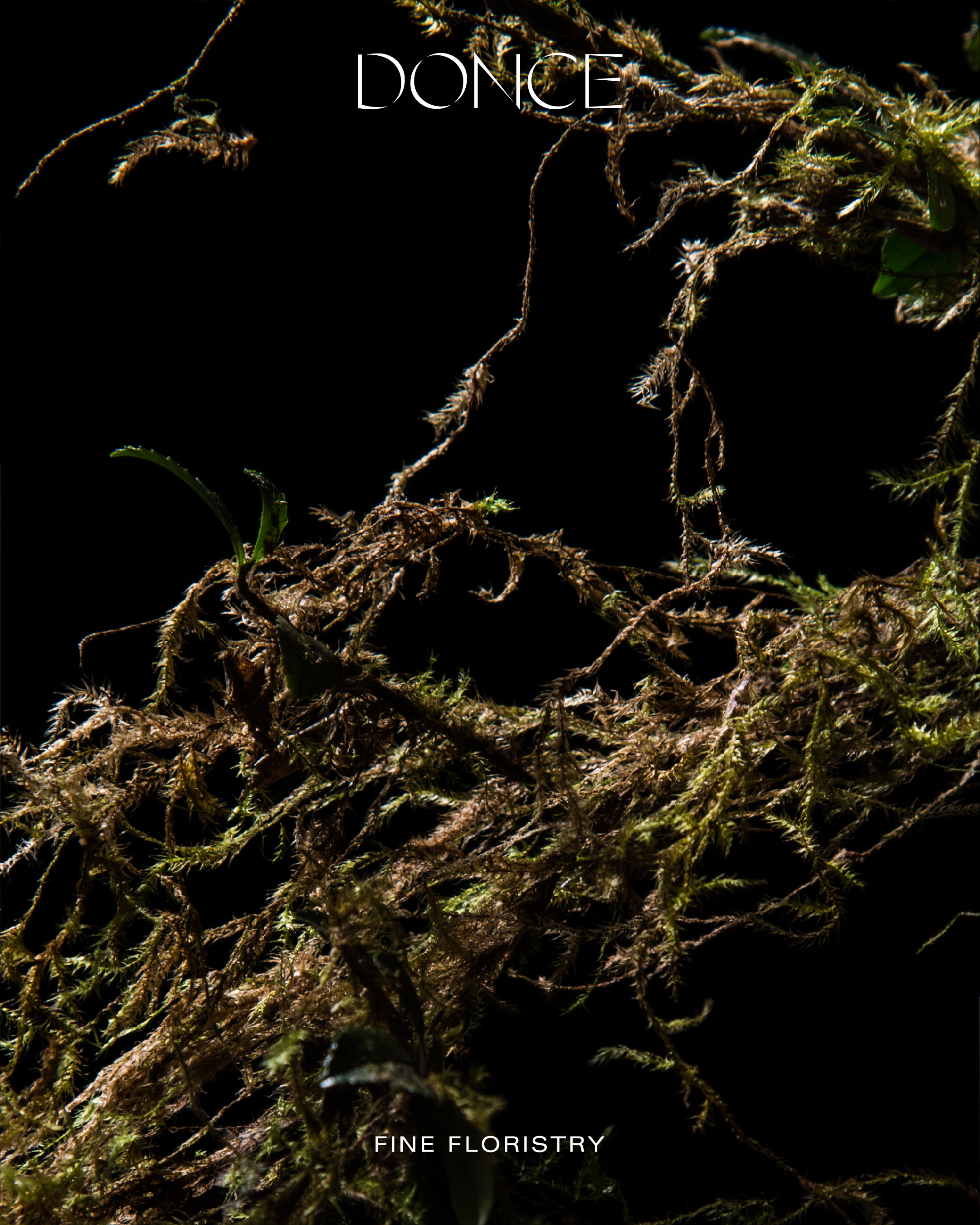
Donce
Visual Identity
Donce is a fine floristry which believes that flowers are a form of experience, expression and emotion. Donce is gentle and strong, edgy and elegant, simple and complex. To translate that into its visual identity, the logo is constructed with lines of thick and thin, and vanishing lines that allow some gaps for good surprises to happen. Photography & logo animation by Edmond Chua.
2019

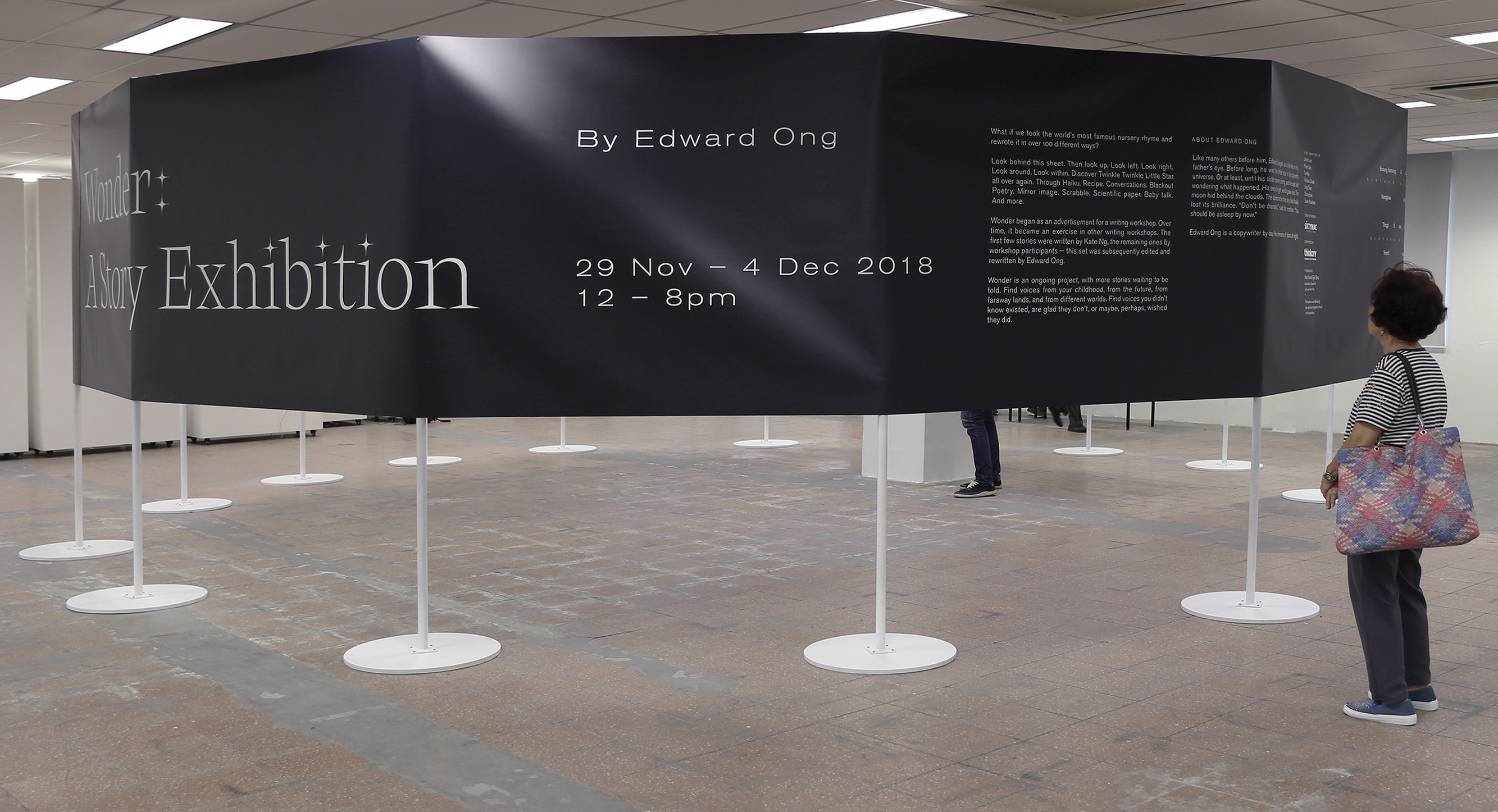
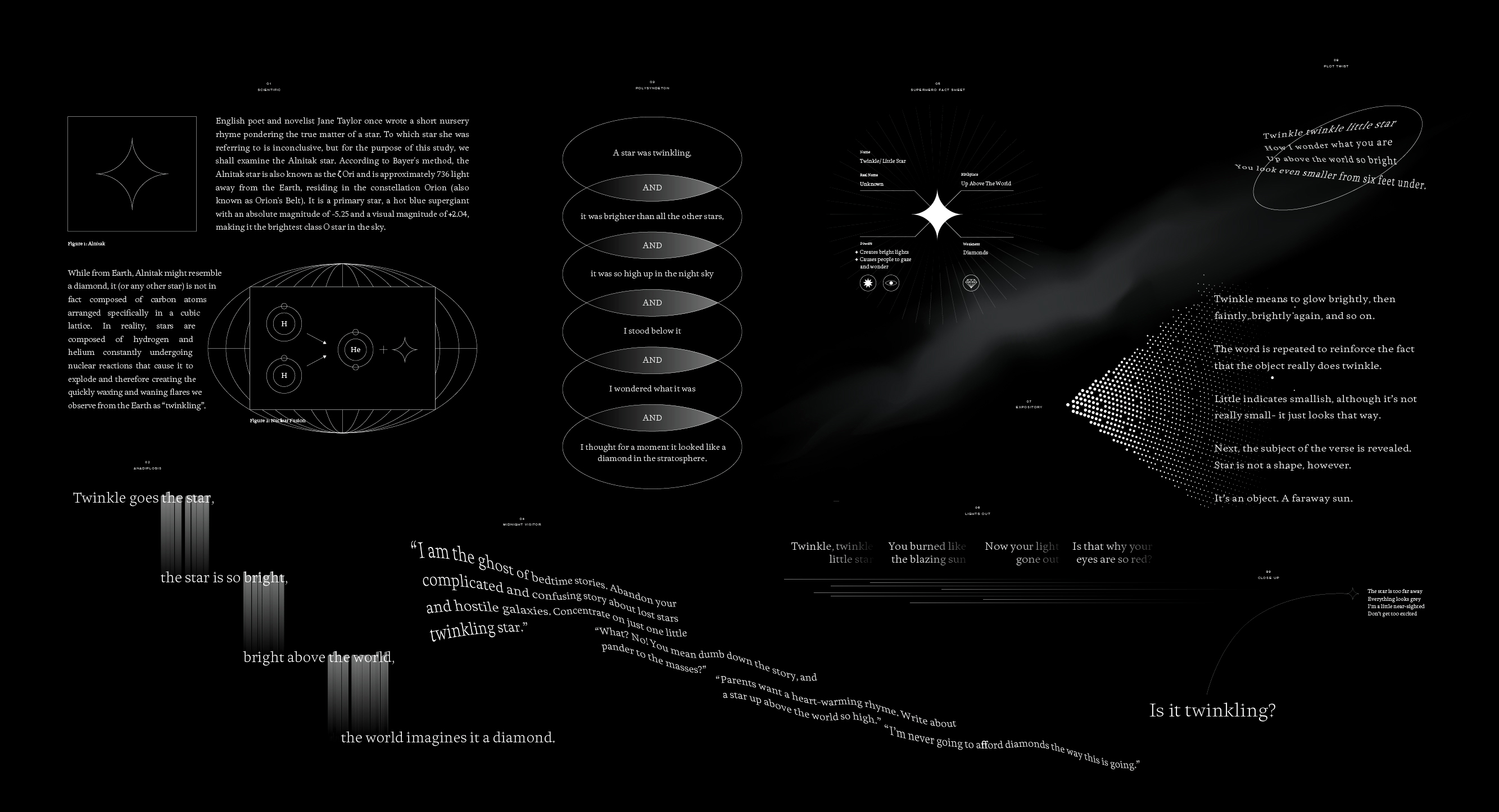
Wonder Story
Exhibition Design
Organised by Edward Ong as part of Gallery Weekend Kuala Lumpur (GWKL). The exhibition showcases various translation of the nursery rhyme we grew up with — Twinkle Twinkle Little Star. Designed with Sueh Li with typeface by Huruf, assisted by David Ho and Low Hsin Yin.
2018

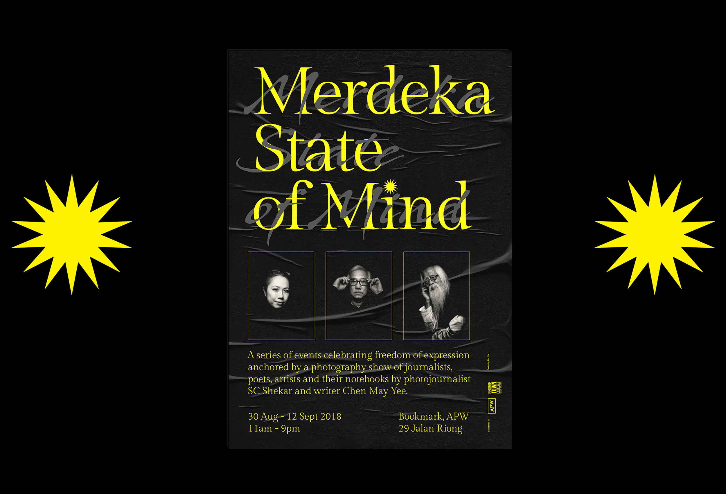
Merdeka State of Mind
Exhibition Design
A photography exhibition of journalists, poets, artists and their notebooks by photojournalist SC Shekar and writer Chen May Yee. It is held at Art Printing Works, Bangsar from 30 August to 12 September 2018, commissioned by and first shown at George Town Festival 2017.
2018
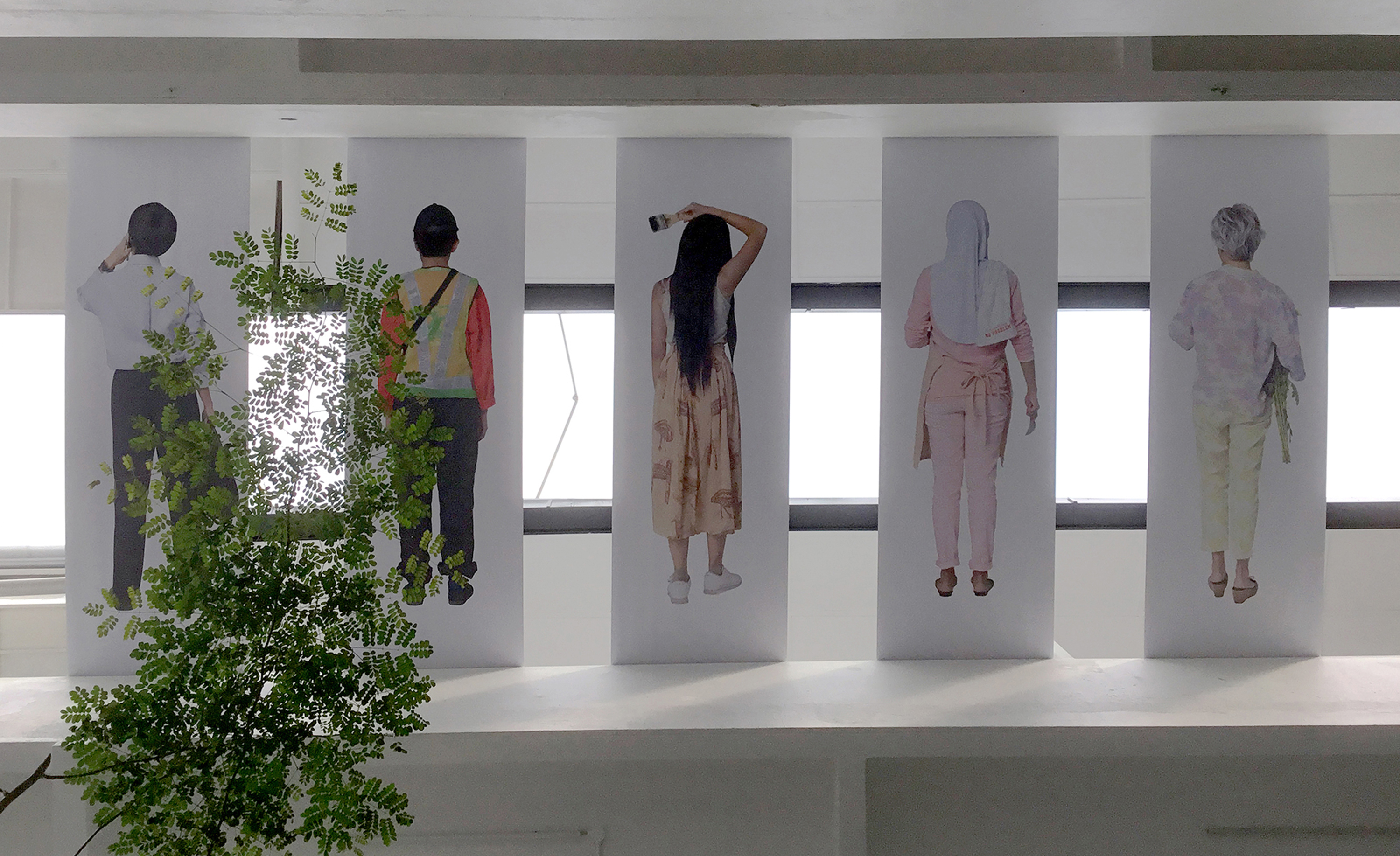
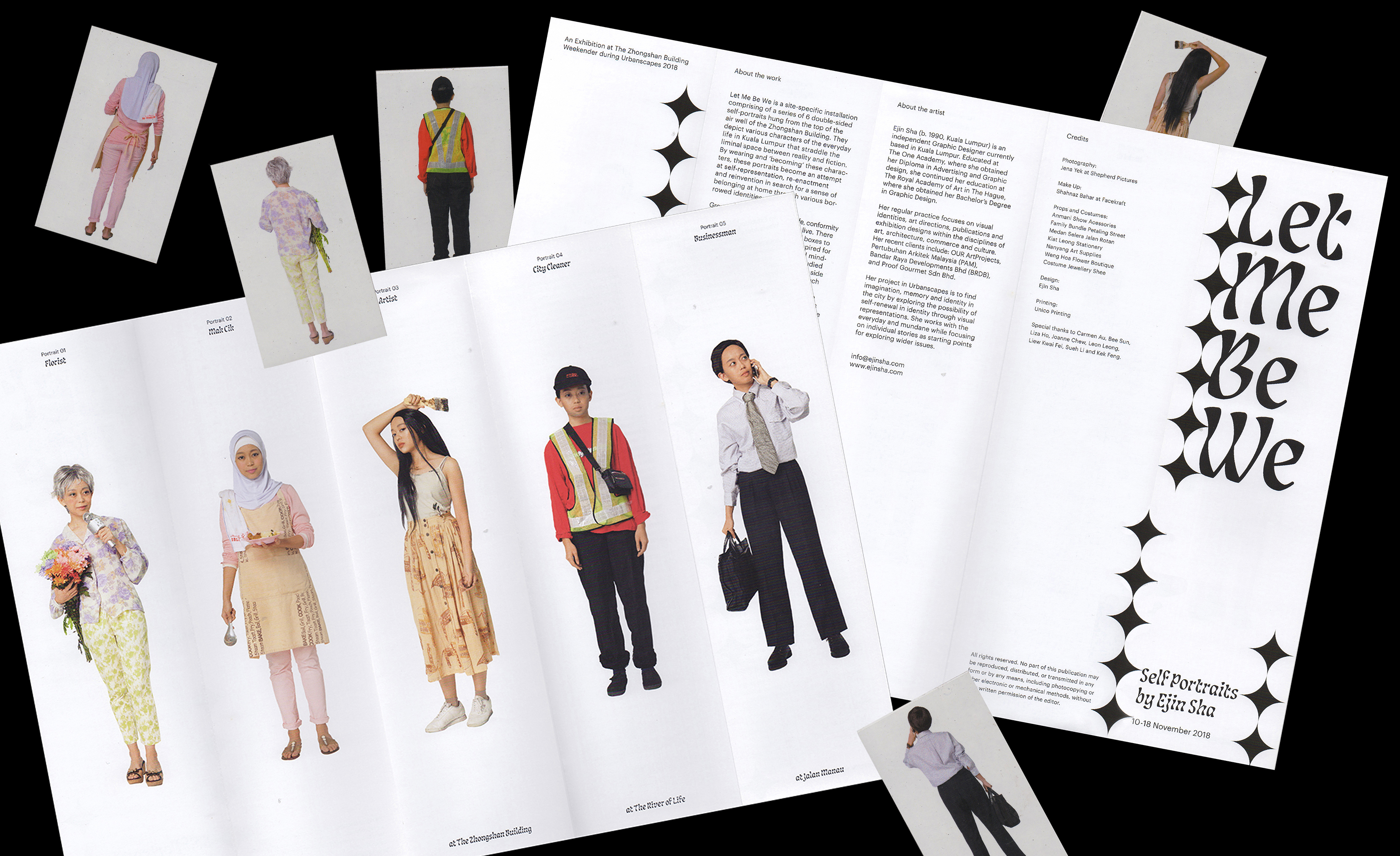
Let Me Be We
Visual Art
A site-specific installation comprising of a series of 5 double-sided self-portraits hung from the top of the air well of the Zhongshan Building. They depict various characters of the everyday life in Kuala Lumpur that straddle the liminal space between reality and fiction.
2018
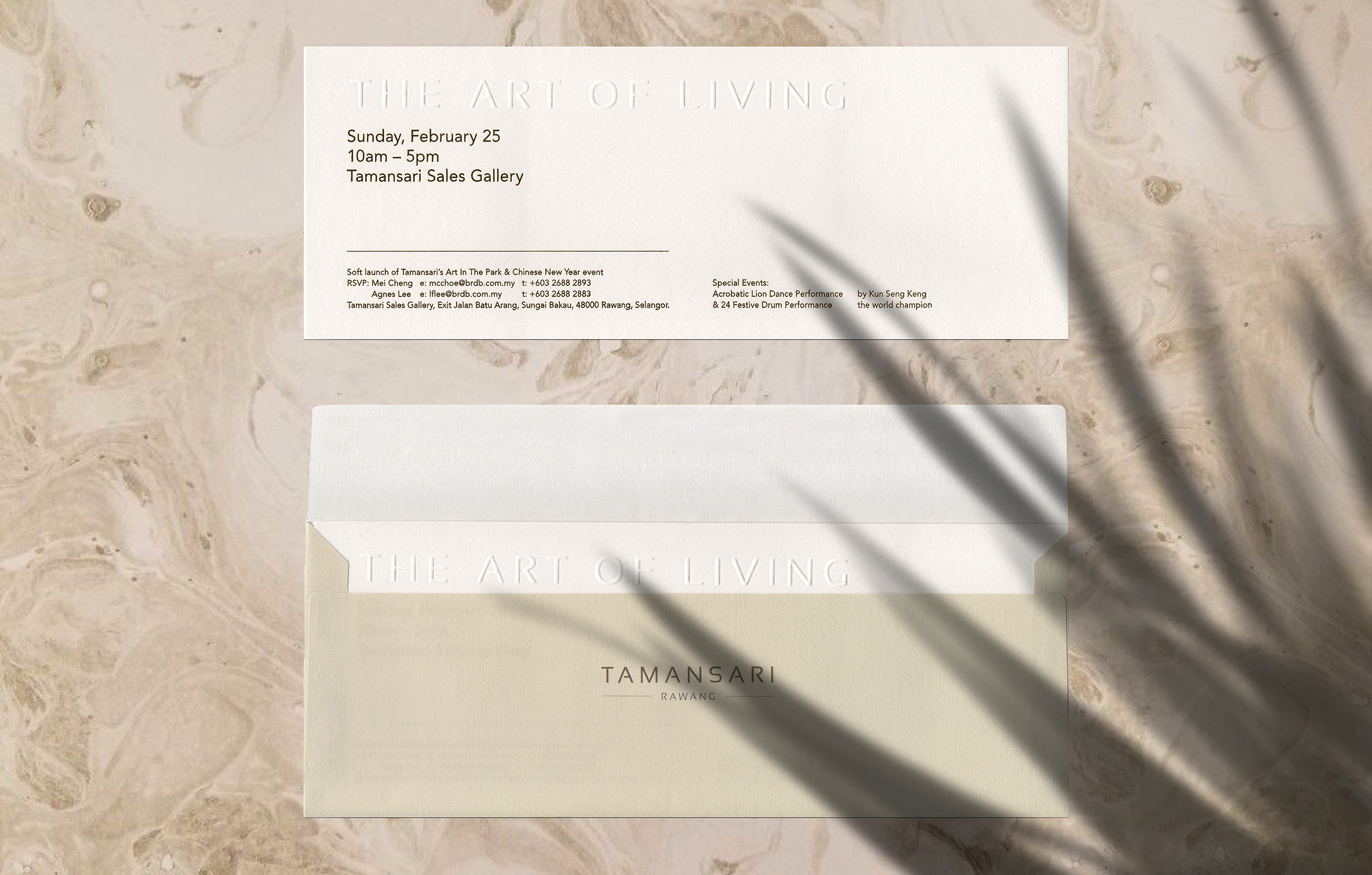
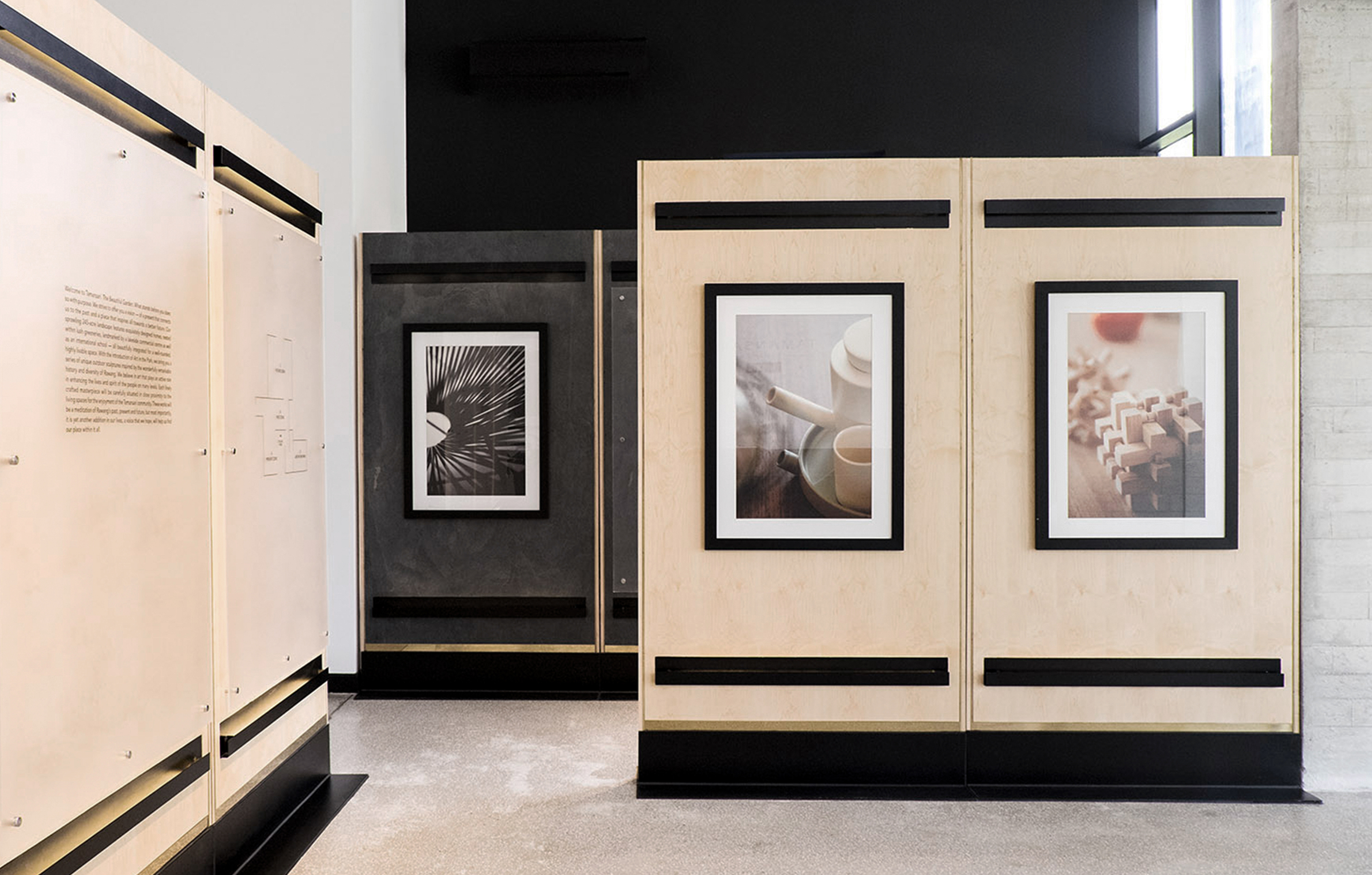
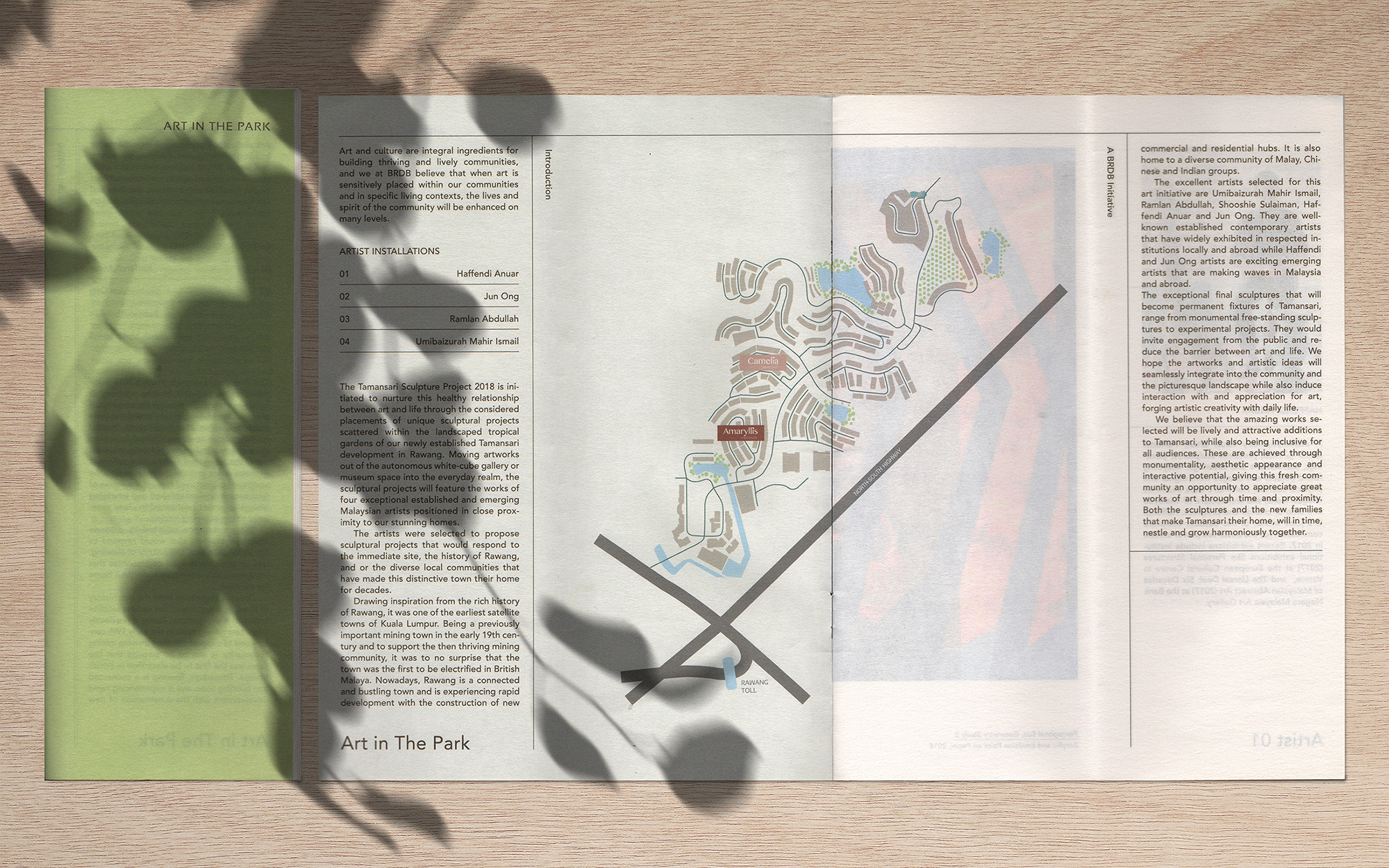
Tamansari Sales Gallery
Exhibition Design
Design for Tamansari Sales Gallery at Rawang by BRDB Developments. Working closely with POW ideas — the interior architecture team to create an integrated exhibition that showcases the new phase and its upcoming Art in The Park initiative. The items designed are the brochure, opening invitation, and the exhibition graphics. Exhibition shot by POW ideas.
2018
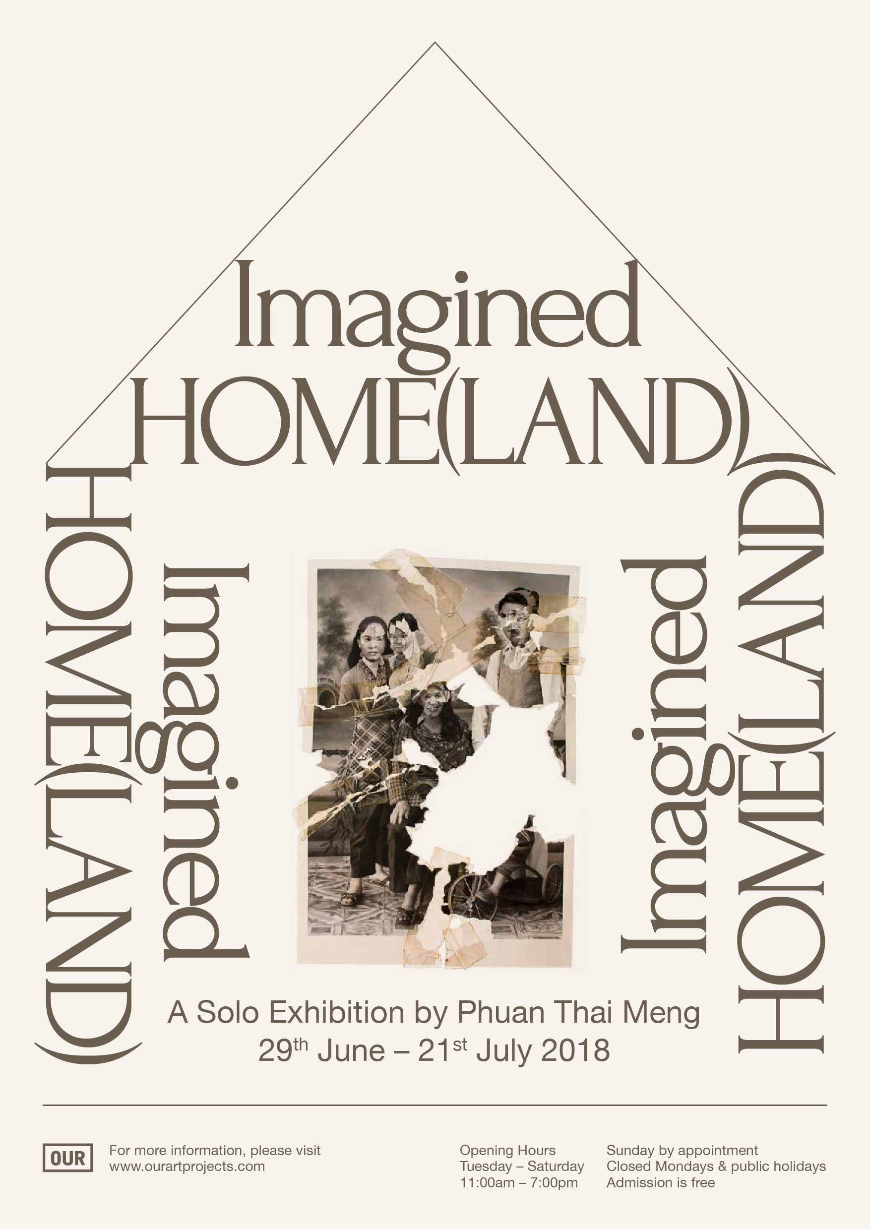
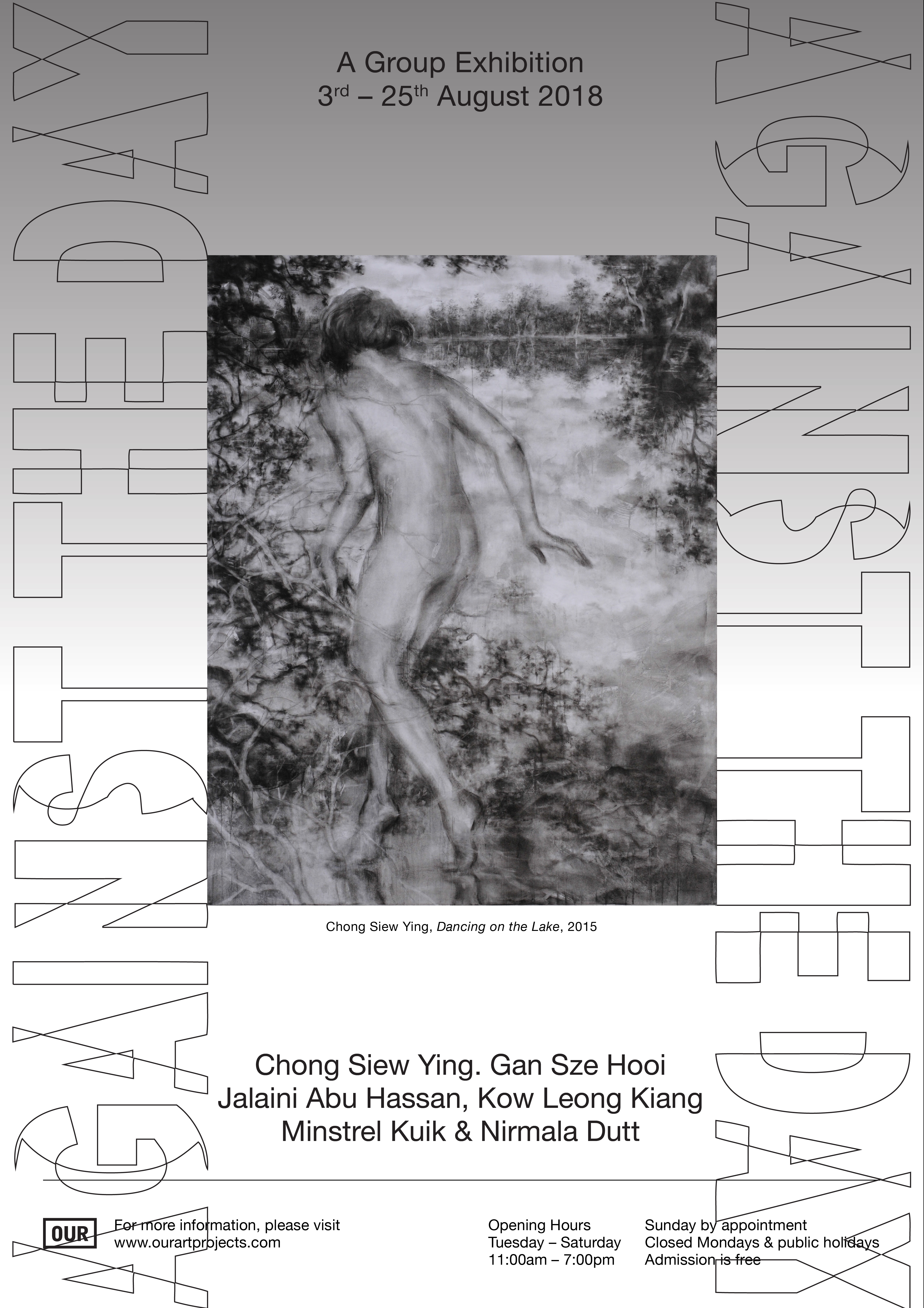
OUR ArtProjects
Collateral Design
Posters, exhibition catalogue and wall text designed for the exhibitions of OUR ArtProjects in 2018.
2018

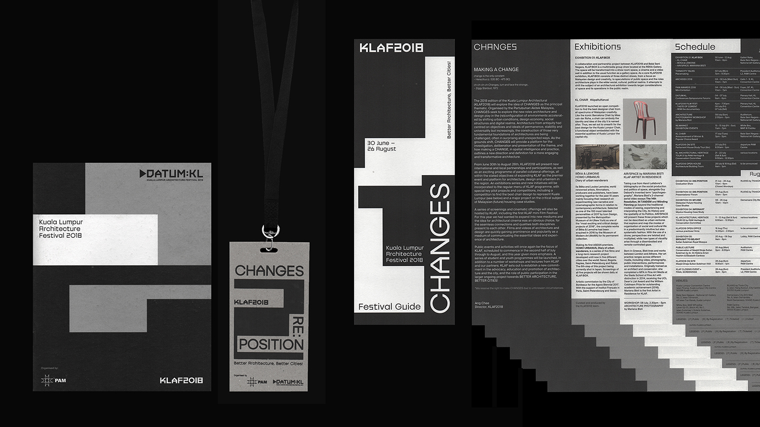
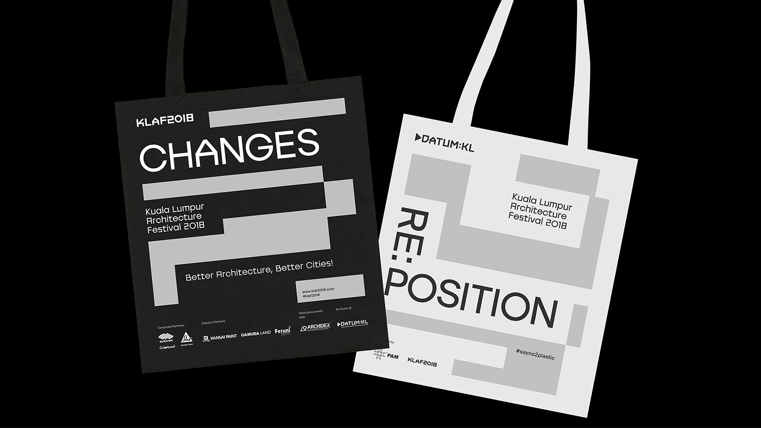
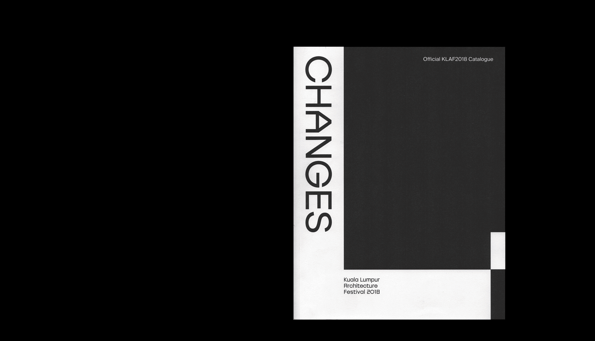
KLAF2017–2018
Visual Identity
Logo & Collaterals design for KLAF2017 & 2018. The Kuala Lumpur Architecture Festival is the main event of the architectural calendar in Malaysia, organised by Pertubuhan Arkitek Malaysia (PAM). The 2018 edition of the festival embarks on the idea of CHANGES as their principal thematic. The visual language was developed with enough flexibility within the design system to allow for a space for repositioning and expression. Designed with LIE.
2017-2018


Proof
Visual Identity
Proof is a Restaurant serving Wine and Pizza baked with proofed dough on wood fire oven. Located at Art Printing Works, Bangsar.
2017


Cracks in The Wall
Booklet Design
A series of booklet design for the exhibition of Leon Leong: Cracks in the Wall at The National Visual Arts Gallery of Malaysia, from 1 November 2017 to 31 March 2018. Installation views by Eiffel Chong.
2017
